Team
UX Designer Thomas Saldanha / UI Designer Blanca Hong
Task
Samsung sell their product across multiple channel partners websites such as Vodafone, EE, Carphone Warehouse and 02, yet have no centralised strategy to guide each partner on how their product and accompanying eco-system should be positioned and presented. Our task was to create a channel partner strategy that would provide best practice guidance on how to increase traffic to Samsung’s S7 phone range, highlight cross product compatibility and introduce the wider Phone+ eco-system, increase product sales and general UX and UI recommendations.
Process
1
Audit
2
Define Strategy
3
Wireframe
4
Best practise design
5
Document
6
Channel partner
roll out
7
Samsung UK
roll out
Establishing the ‘ideal’ feature hierarchy
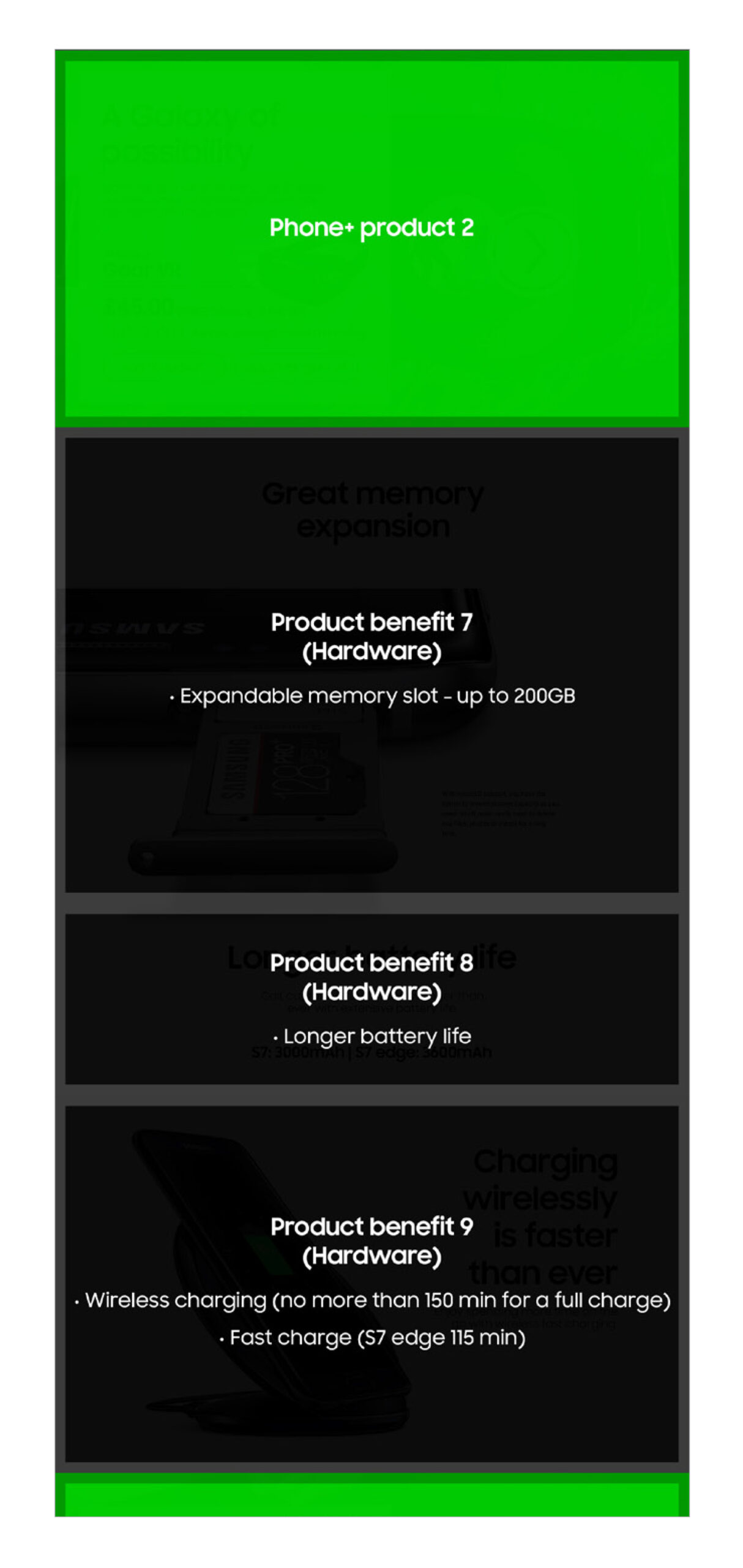
My first task was to digest Samsung’s product documentation to get a better understanding on which product features the business prioritised. Simultaneously, our data team conducted some social media analysis on what customers were discussing and searching for. This provided us with critical insight to what product features our customers were excited about or needed further clarification on.
We then consolidated both the business and customer priorities, to establish an ‘ideal’ feature hierarchy that would target both the business and customer’s primary needs.
Samsung's priorities
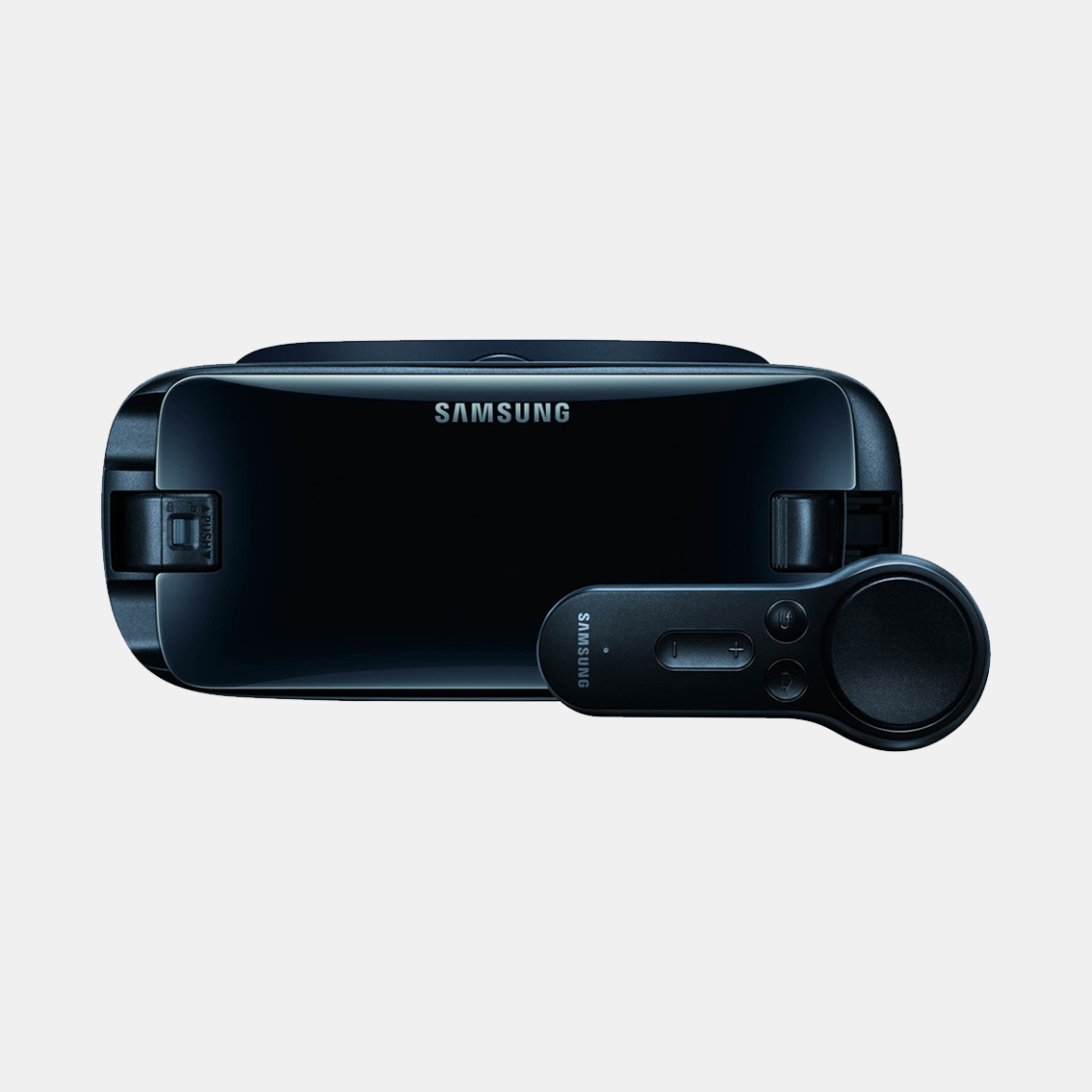
1. Controller
2. Apps
3. Design
4. Wide field of view
5. Compatability
6. 3rd party partners
7. Oculus social
Customer's priorities
(% of interest on social)
1. Controller - (44%)
2. Headset - (21%)
3. Apps - (19%)
4. Experience - (9%)
5. Compatability - (4%)
6. Design - (3%)
7. Comfort - (2%)
Define each features primary messaging
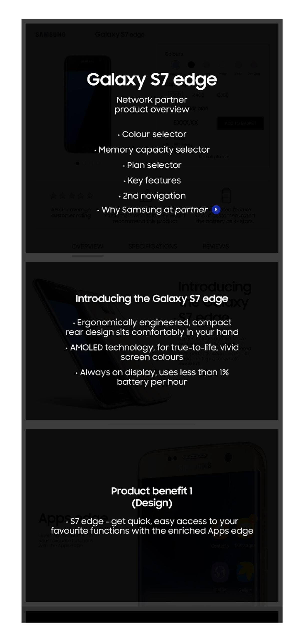
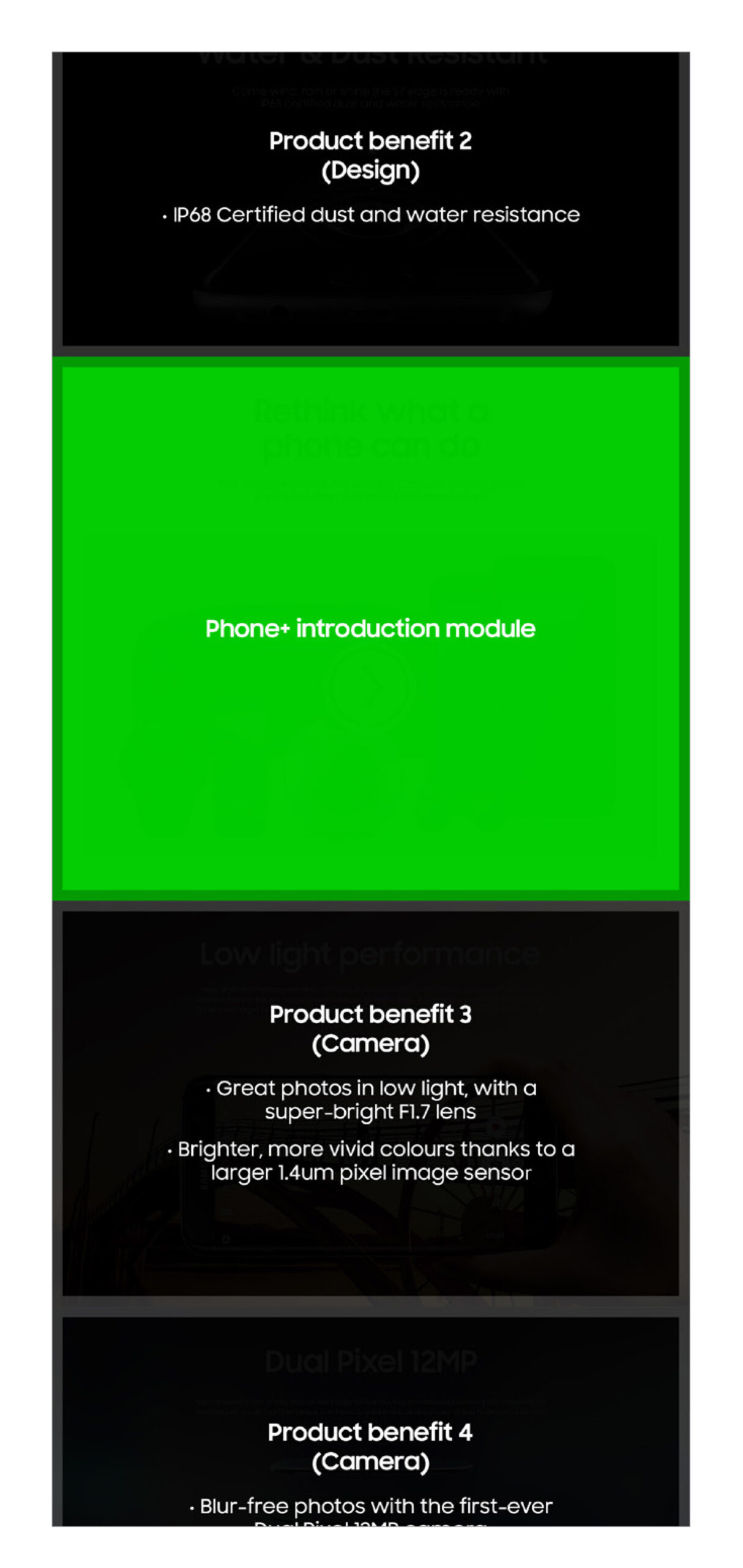
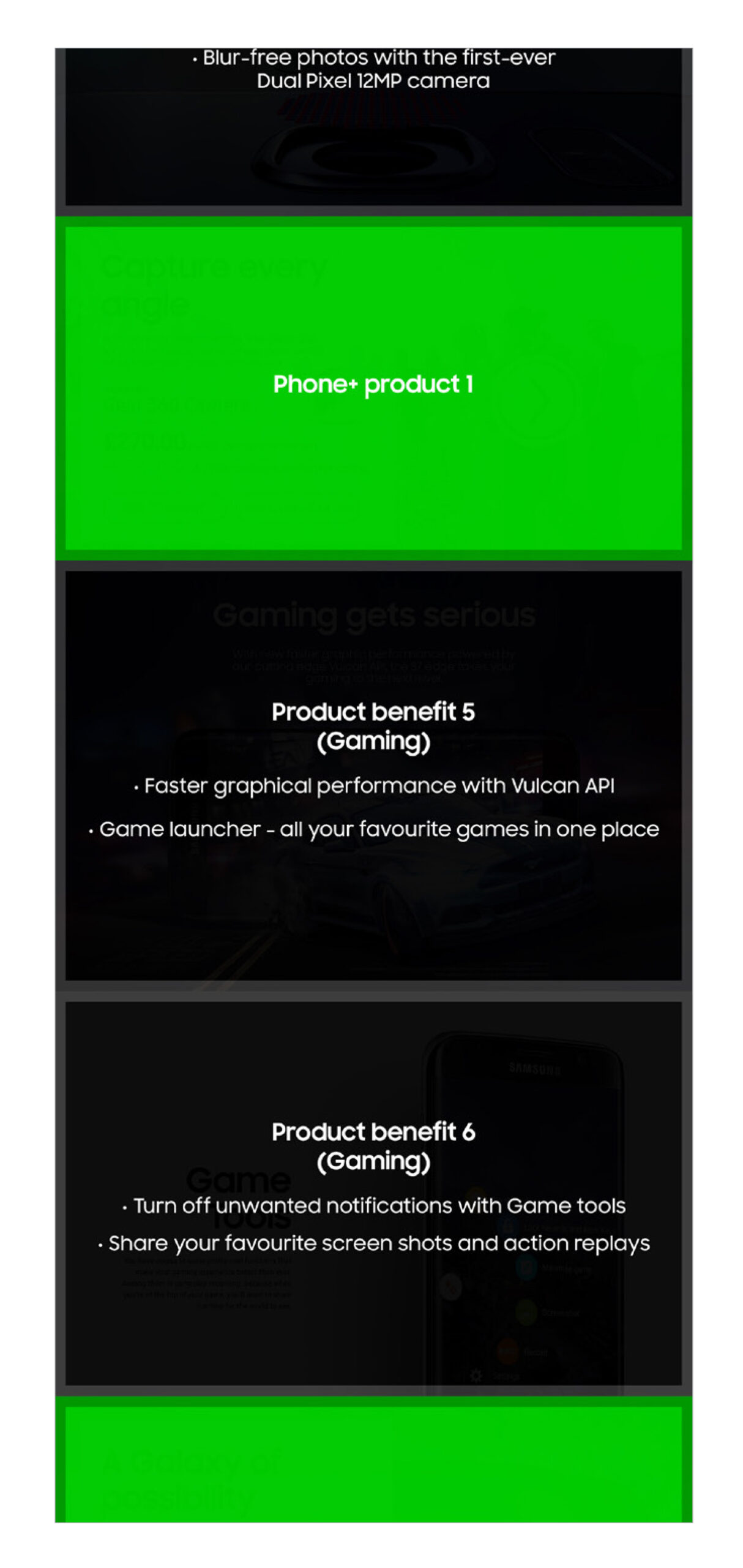
Once the ‘ideal’ feature hierarchy was established, I took our findings from the earlier research and established what was the primary messaging we wanted to convey for each feature. For example, what were the key elements of the camera that we wanted to promote.
I conducted this exercise for all of the products features and documented my recommendations via a series of stripped down wireframes.
Highlighting the eco-system
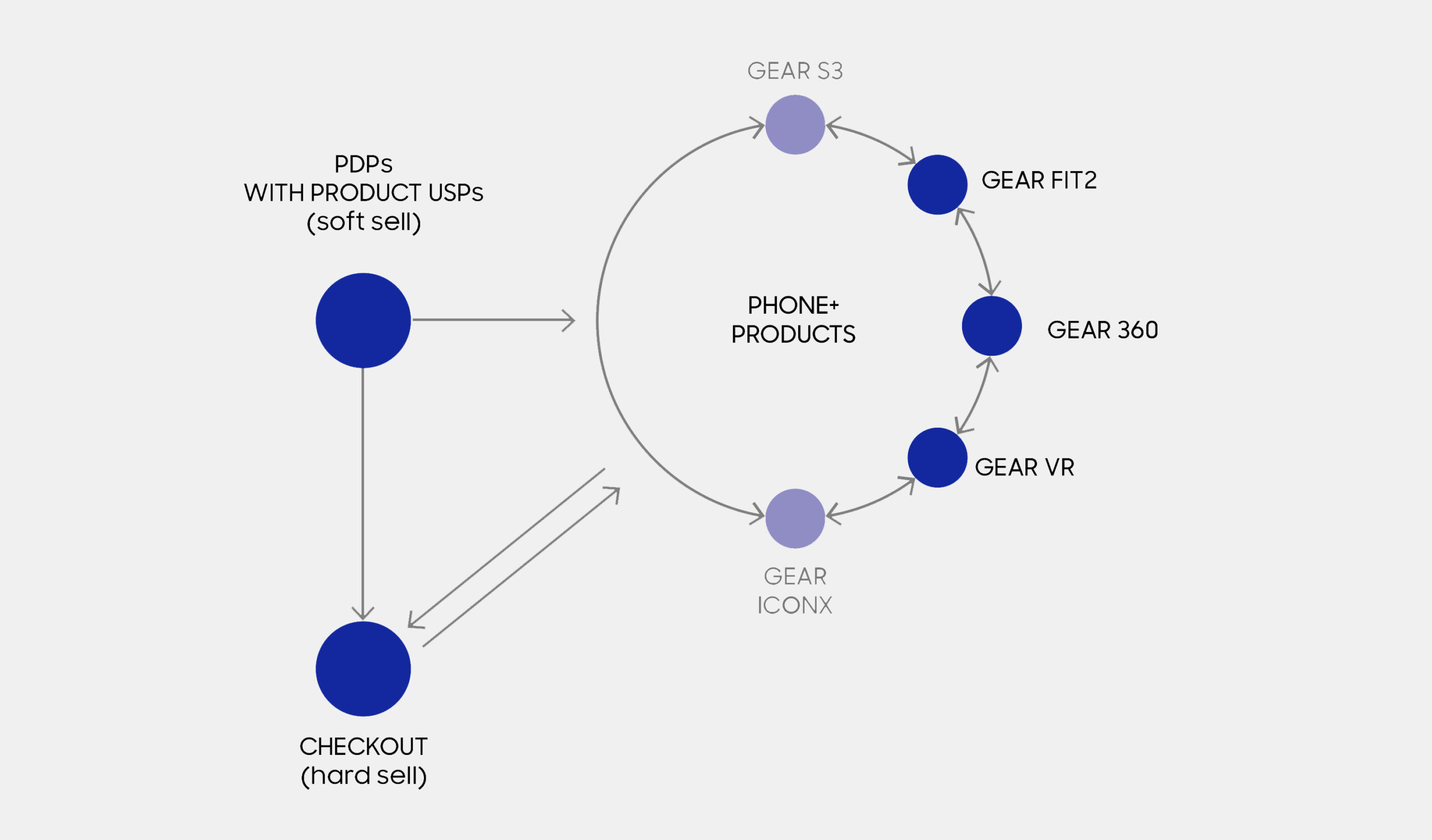
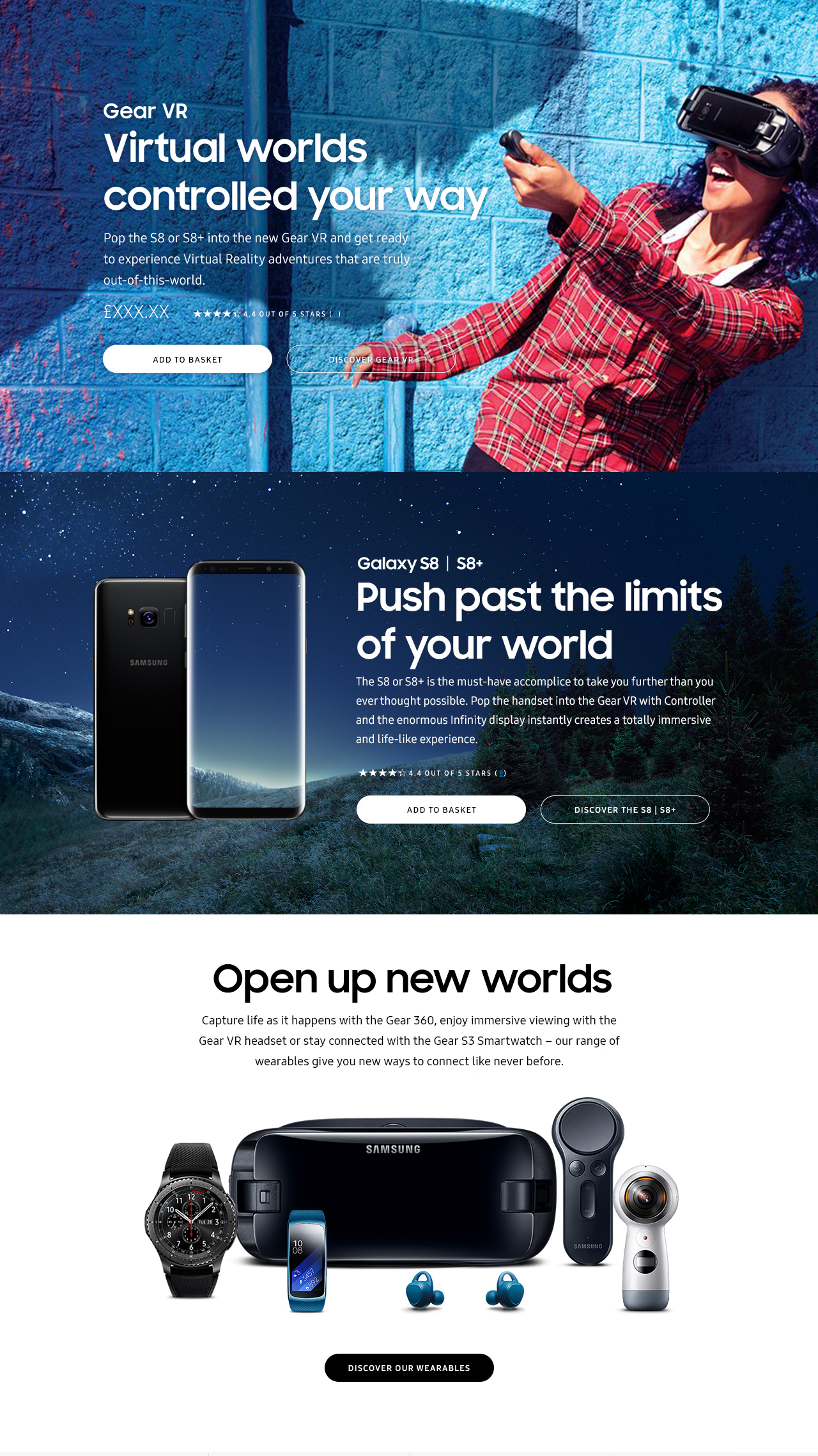
We created a series of eco-system modules that had the primary role of highlighting cross product compatibility. Our goal was to ensure that regardless of entry point, our customers were always aware and able to access the wider Samsung product range. Where possible in-page, we visually demonstrated how each product can enhance the customer’s life when used together, for example the 360 camera can create immersive content for the Gear 360 VR headset.
Best practise design
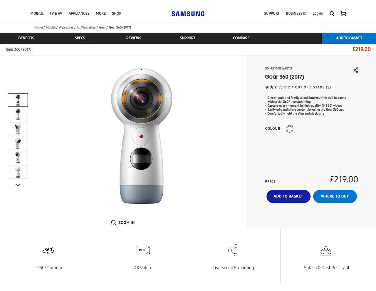
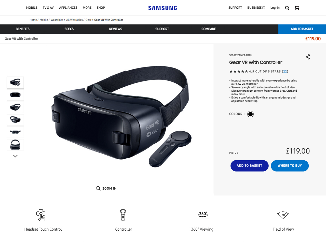
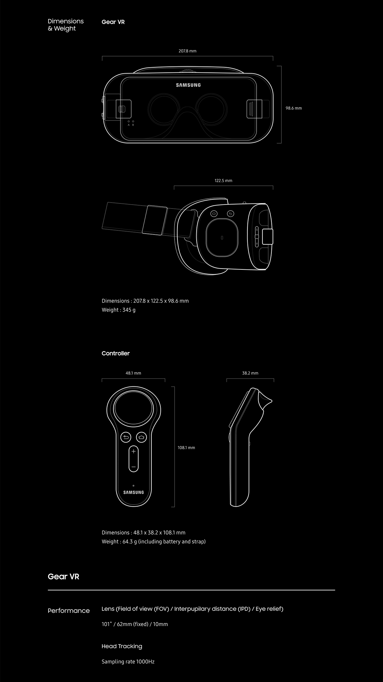
Once the client signed off our strategic approach, we progressed the strategy into design and produced the following 'best practice designs'. This provided Samsung's channel partners with a reference on how the strategy should ideally be executed.
Please note: I established the UX and strategy for each of the product detail pages, however, the visual design was executed by the ever-talented UI Designer - Blanca Hong.
Documentation
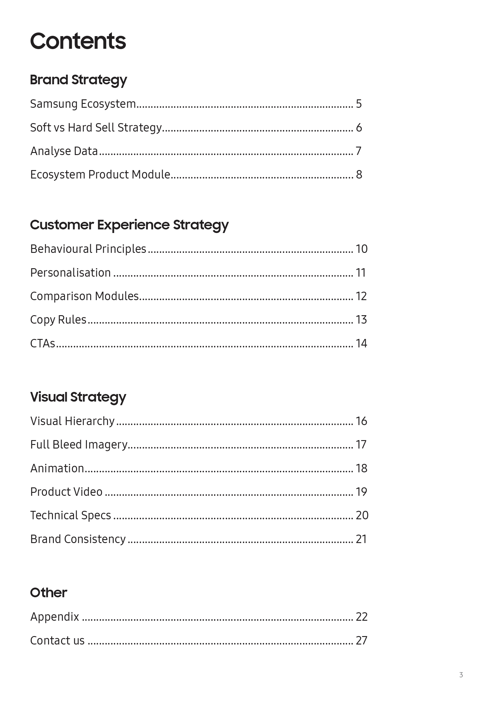
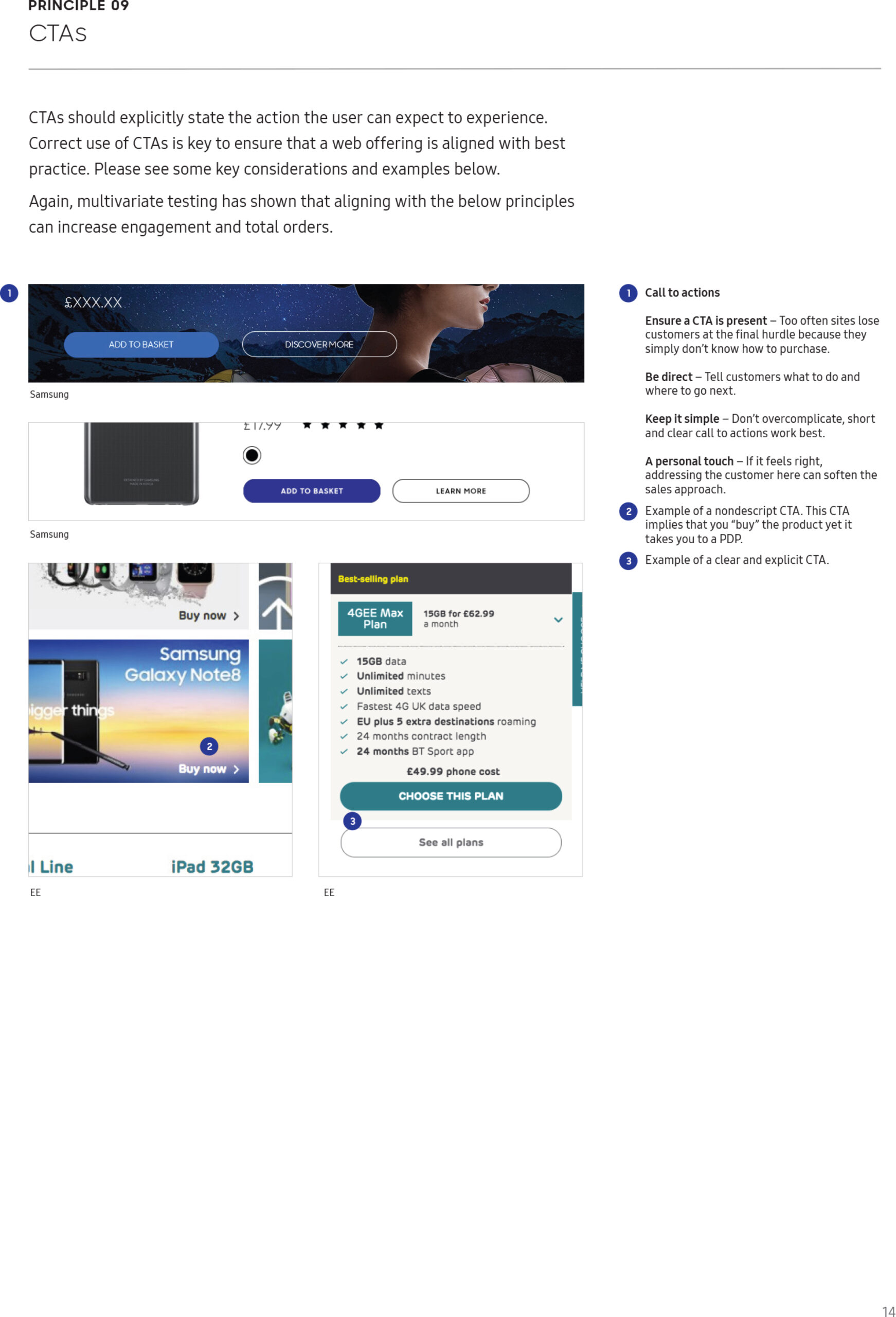
Each channel partner has their own unique design and brand guidelines to adhere to alongside a range of bespoke technical limitations. Therefore, rather than making hundreds of minor adjustments to each design to ensure it works across each brand, we documented our strategy into 15 overarching principles. This document allowed each channel partner's internal design and development team to take and adapt our strategy and make it work within their websites limitations.
Channel partner roll-out
Once the strategy was defined and documented, we provided support to assist the following channel partners in implementing our designs; Vodafone, EE, Carphone Warehouse and 02.
Samsung UK roll-out
Due to the success of the channel partner roll-out, we were requested to implement our strategy across the Gear VR and Gear 360 camera product pages for the Samsung UK website.
Please note: I established the UX and strategy for each of the product detail pages, however, the visual design was executed by the ever-talented UI Designer - Blanca Hong.
Fancy a chat?
