Team
UX Designer Thomas Saldanha / UI Designer Sean Valentine / Creative Beki Reilly Animator Mike Tang / Developer Jaime DeFederico
Task
To celebrate the launch of Wacom's new tablet, we created an interactive, digital art gallery that exhibited brand sponsored artists work that was created using the new product, the Cintiq Pro. We were to bridge the gap between consumer, artist and brand by providing behind the scenes access to exclusive content, detailing how the artist utilised the new tablets features to produce their artwork.
Process
1
Breakdown brief
2
Homepage
3
Artist gallery
4
Animations
5
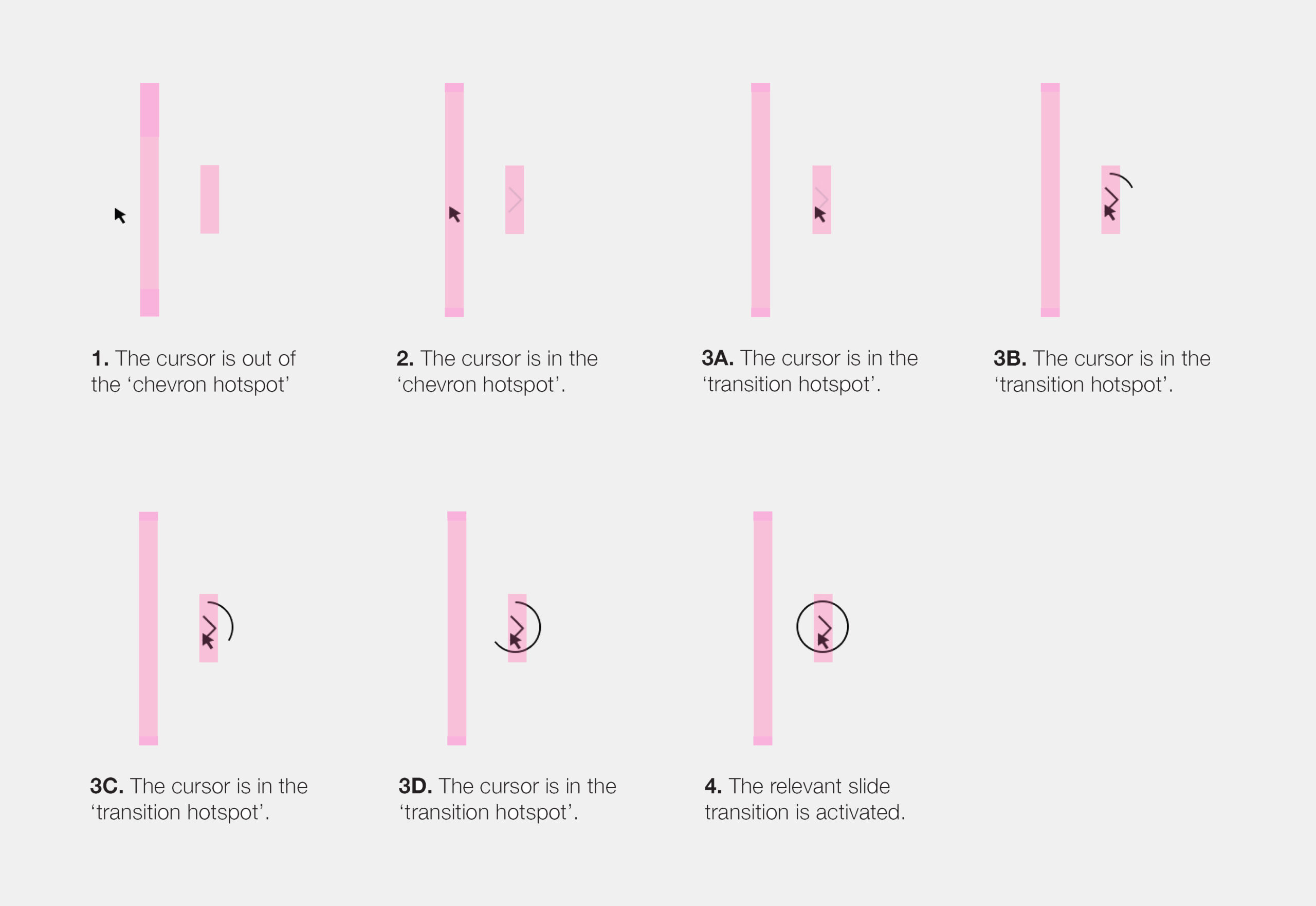
Transitions
6
Mobile designs
7
Documentation
8
Development
The concept
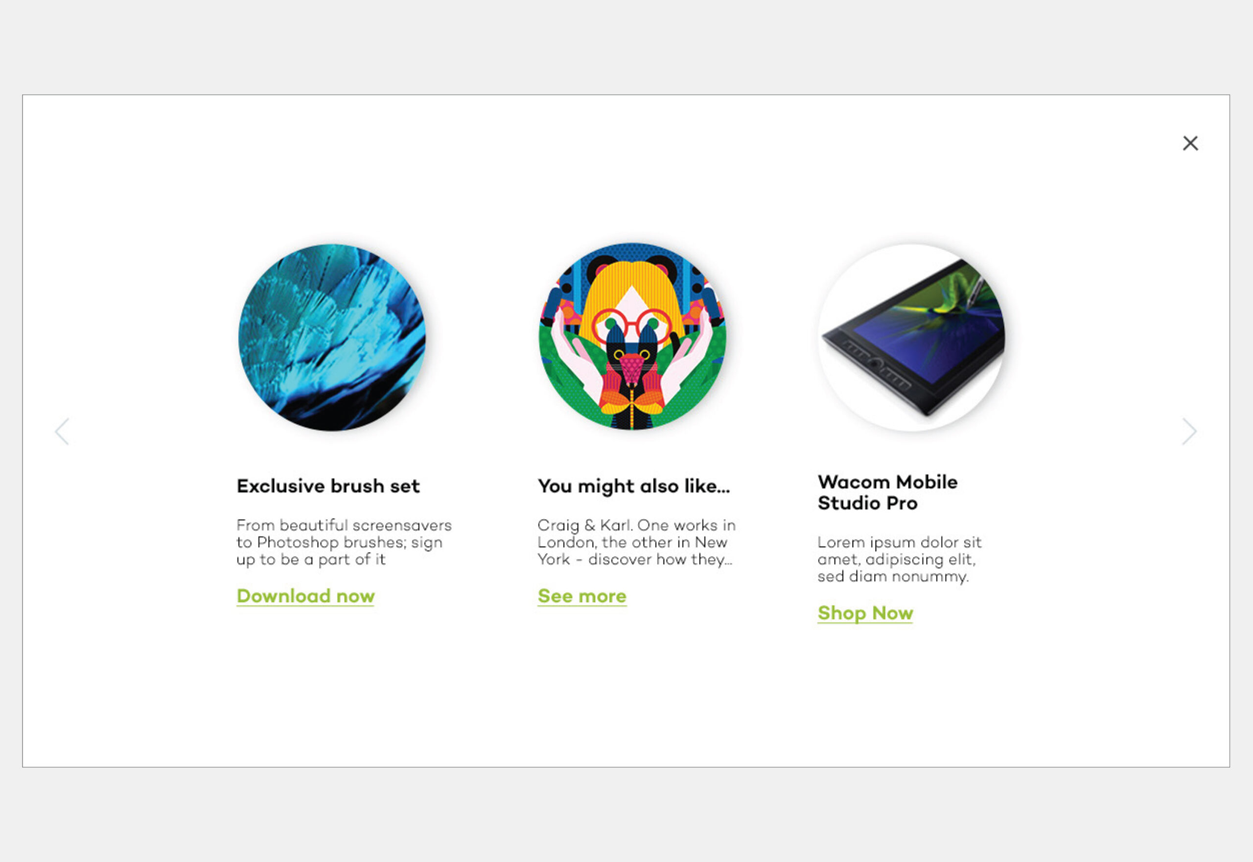
Create a playful, interactive digital art gallery to showcase WACOM’s brand sponsored artists work. Each artist was provided a page where they could showcase their work, provide tutorials on how to recreate their unique style and provide access to exclusive downloadable content such as digital brushes that may be used across their WACOM devices.
Breaking down
the brief
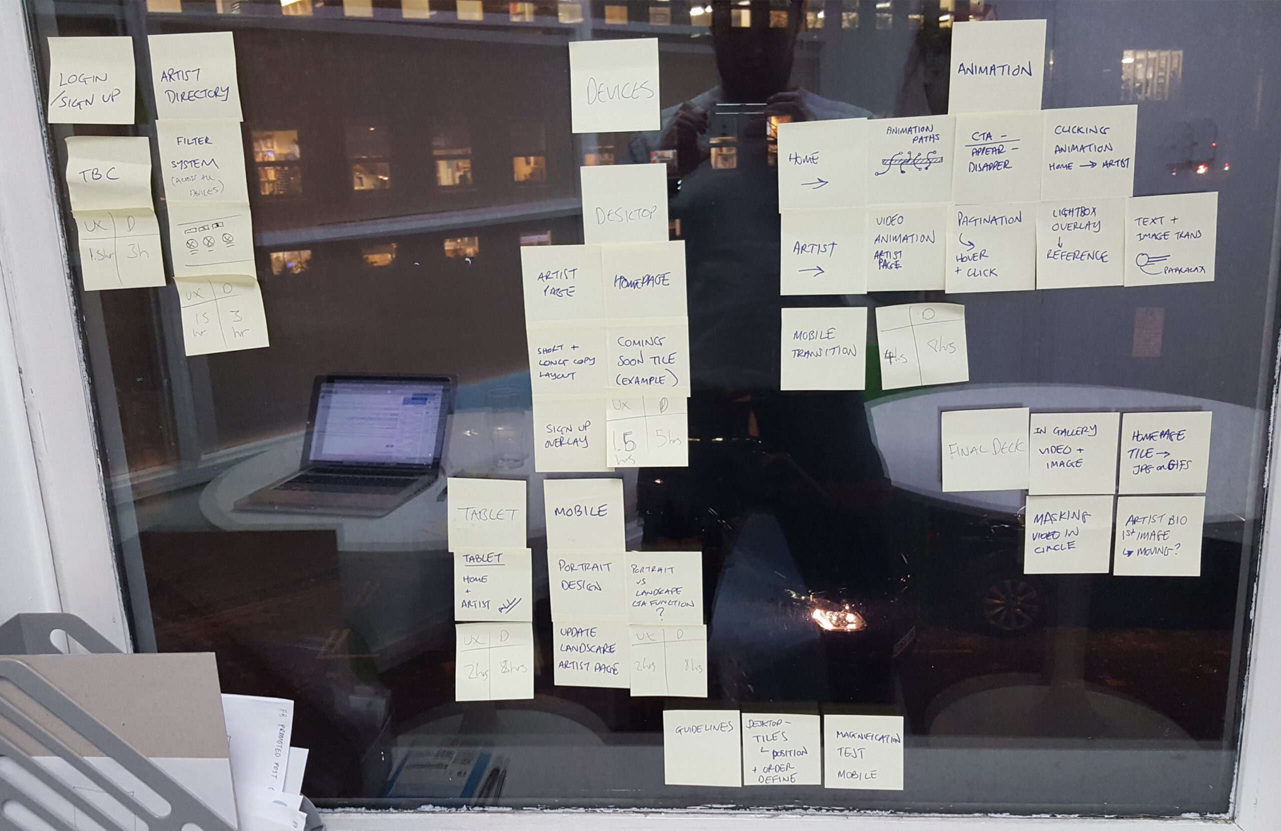
My first exercise was to break the creative brief into individual tasks in order to scope and produce a project plan. I worked closely with the Visual Designer to break the brief down into a series of core topics; homepage, artist pages, search, animations, transitions and mobile responsive designs. By doing so we found it easier to focus on a series of mini-problems, rather than one mammoth creative challenge.
Homepage
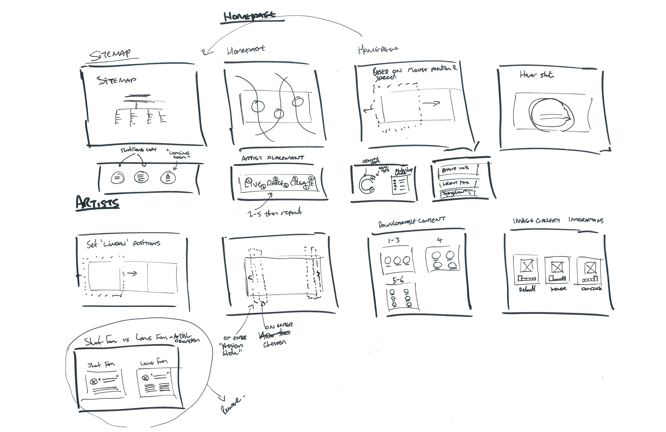
To bring awareness to the campaigns tagline ‘LIVE.DARE.CREATE’, we made it the central focus of the homepage. To form a relationship between the campaign and artists, we intertwined a series of tiles that enabled users to access their favourite artists dedicated gallery within the website.
Animation based on mouse movement
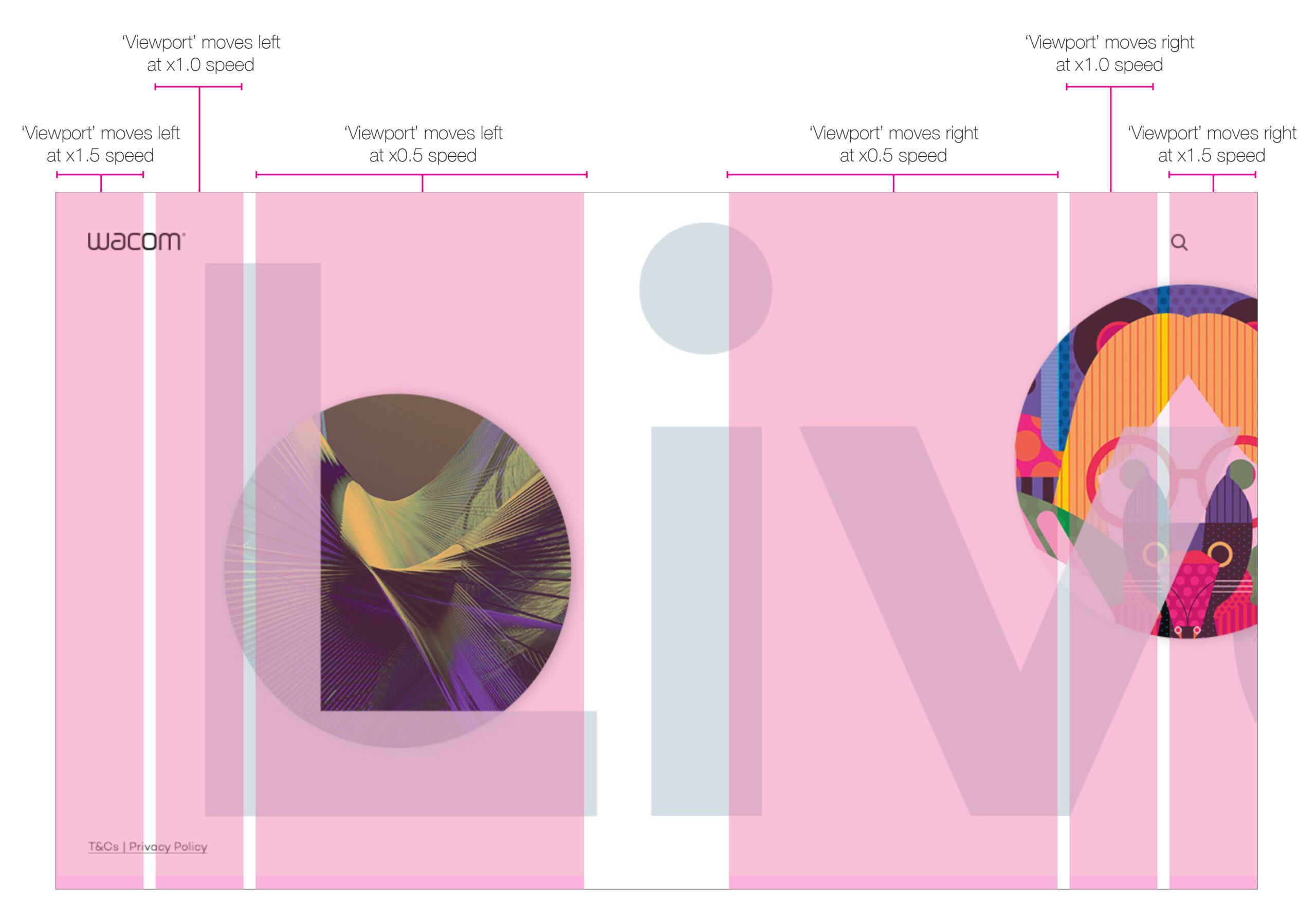
We wanted to introduce an element of play within our gallery, so decided that the artist tiles within the homepage should dynamically float across the users screen and change speed and direction, depending on their mouse position and movement. Essential, the page dynamically responds to how the user interacts with it.
Animation paths
We originally had the artist tiles float randomly across the screen, however, an early prototype highlighted this was less than favourable and created a clunky, disjointed experience. After consulting with our animation team, we decided the way forward was to define a series of set animation pathways that each tile would transition across.
Artist tile weaving
To appear as if each artist tile was weaving in-between each letter of the campaign's tagline, we created three layers of content. The top and bottom layer alternatively housed the artist tiles and the central layer housed the tagline.
What the user sees
Artist gallery
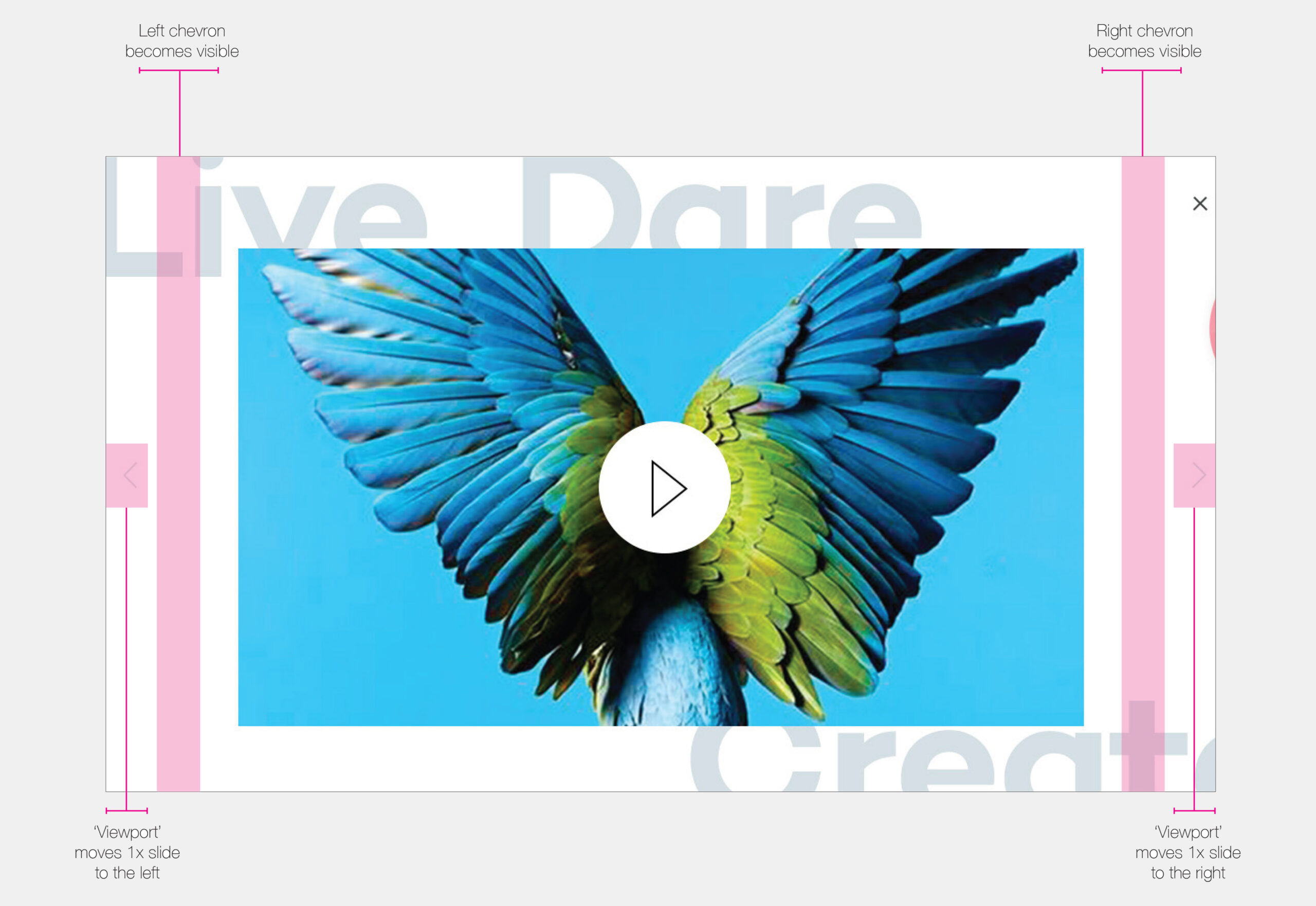
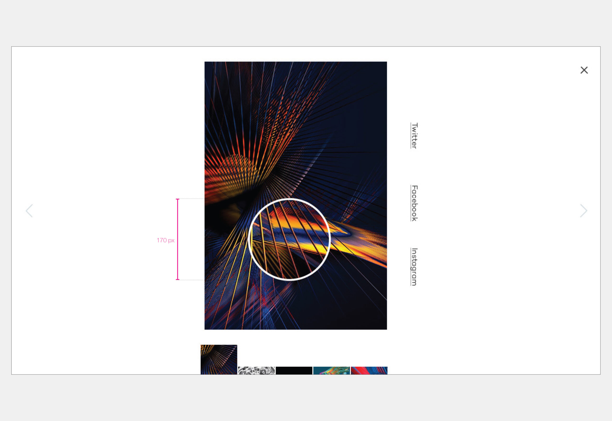
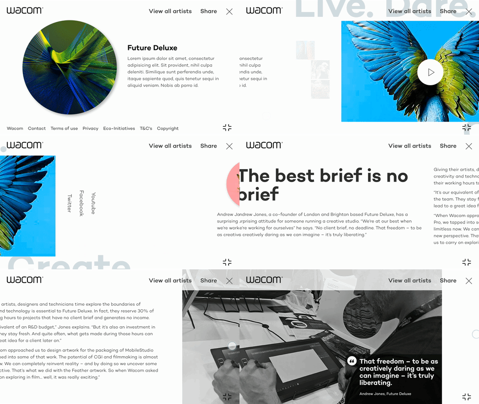
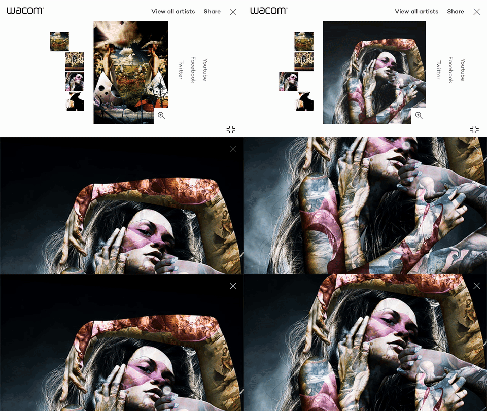
Each artist was provided a page where they could showcase their work, provide tutorials on how to recreate their unique style and provide access to exclusive downloadable content such as digital brushes that may be used across their WACOM devices
Mobile designs
Due to the heavy nature of the custom animations across the desktop experience, a considerable amount of time was spent ensuring the interactive charm was not lost on a mobile device.
Collaboration
was key
This project was incredibly collaborative across a range of disciplines; UX, UI Design, Creative teams, Animators and Developers. It’s my favourite project I’ve worked on and would not have been the success it was had we not had such a wonderful team.
Fancy a chat?
