Team
UX Designer Thomas Saldanha / UI Designer Borja Sampedro
Task
E.ON had an 18 month road map which included features and functions that their present apps architecture could not support. My task was to identify areas of opportunity where we could revise their architecture and navigation to support these future plans.
Process
1
Open card sort
2
Draft IA
3
Tree test
4
User test
5
Revise design
6
User test
7
Prep for development
8
Development
Open card sort
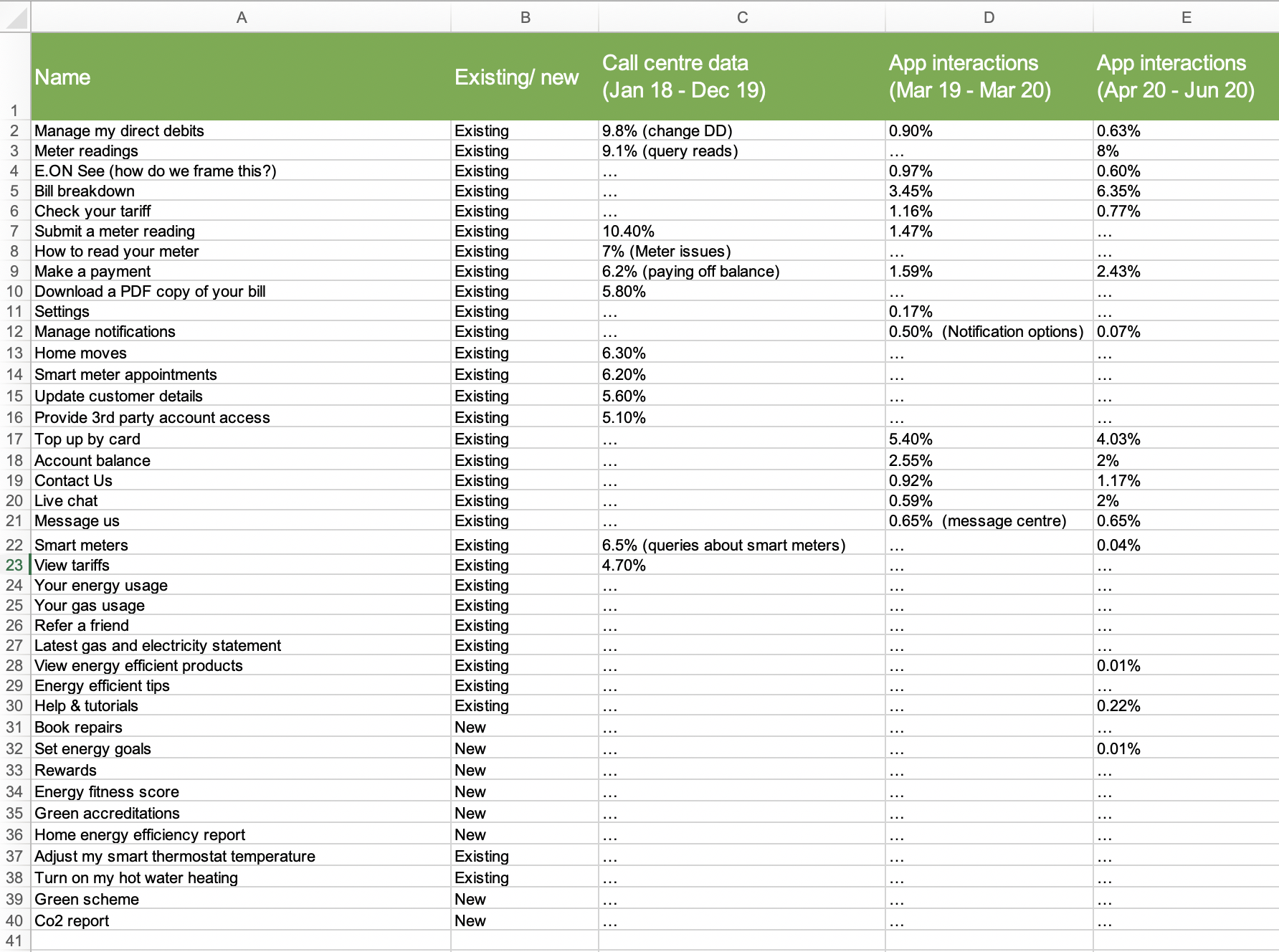
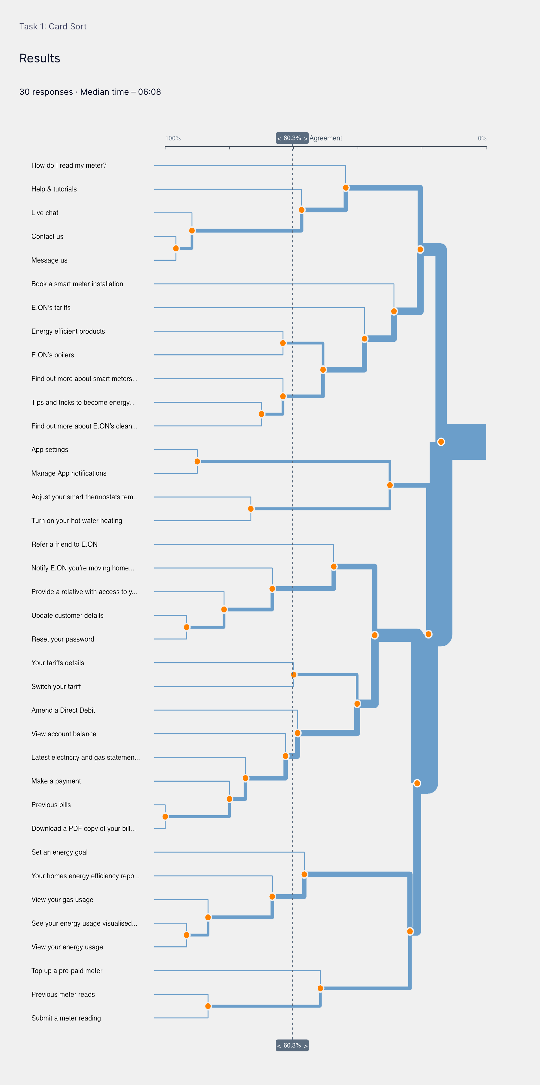
To find out how E.ON’s customers think the content should be organised and categorised, I conducted an open card sort. I asked 30 participants to sort 37 cards. I shortlisted the cards down to 37 by analysing the apps analytics to identify what were the most frequented screens and features over the last year, alongside a representative samples of key items the client had prioritised from the 18 month roadmap. This ensured our results would be relevant for both the current and future states of the app.
Draft revised Information Architecture
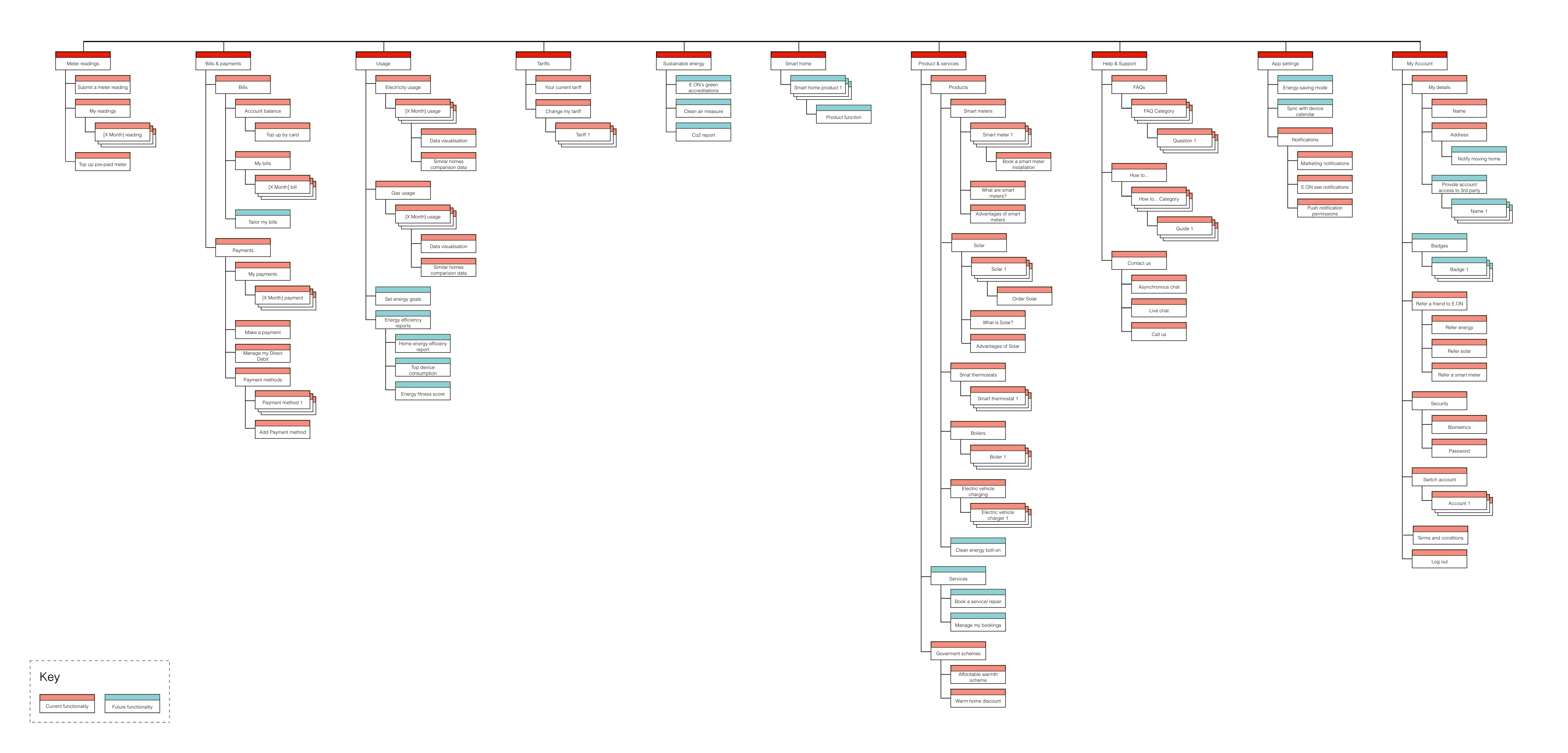
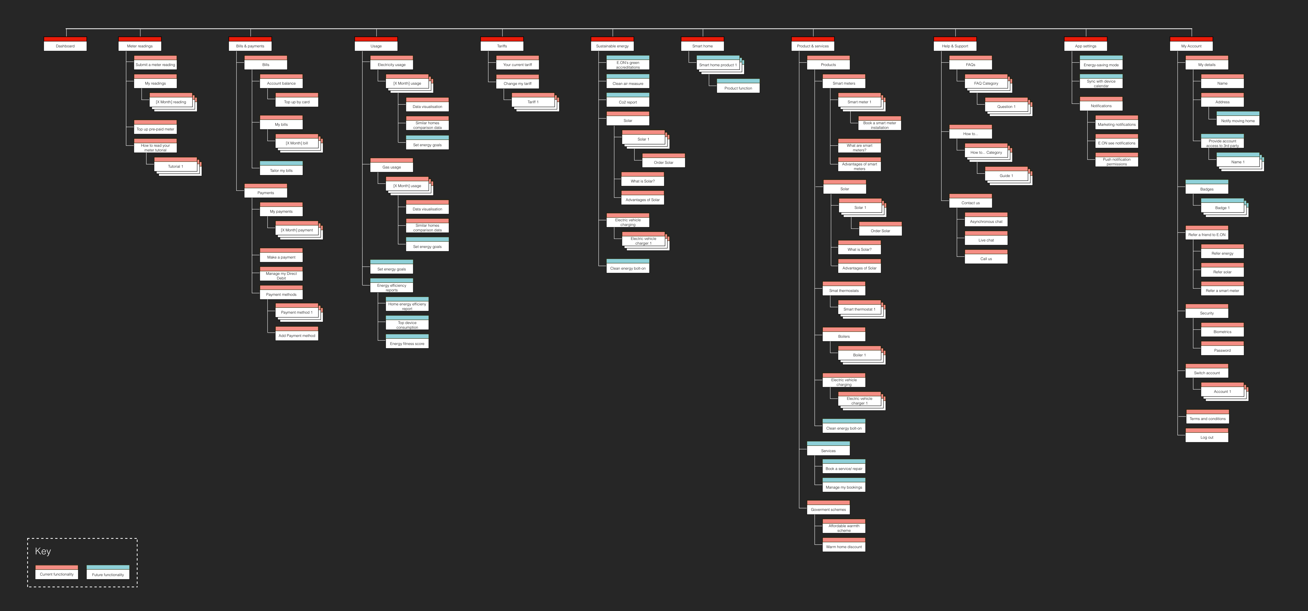
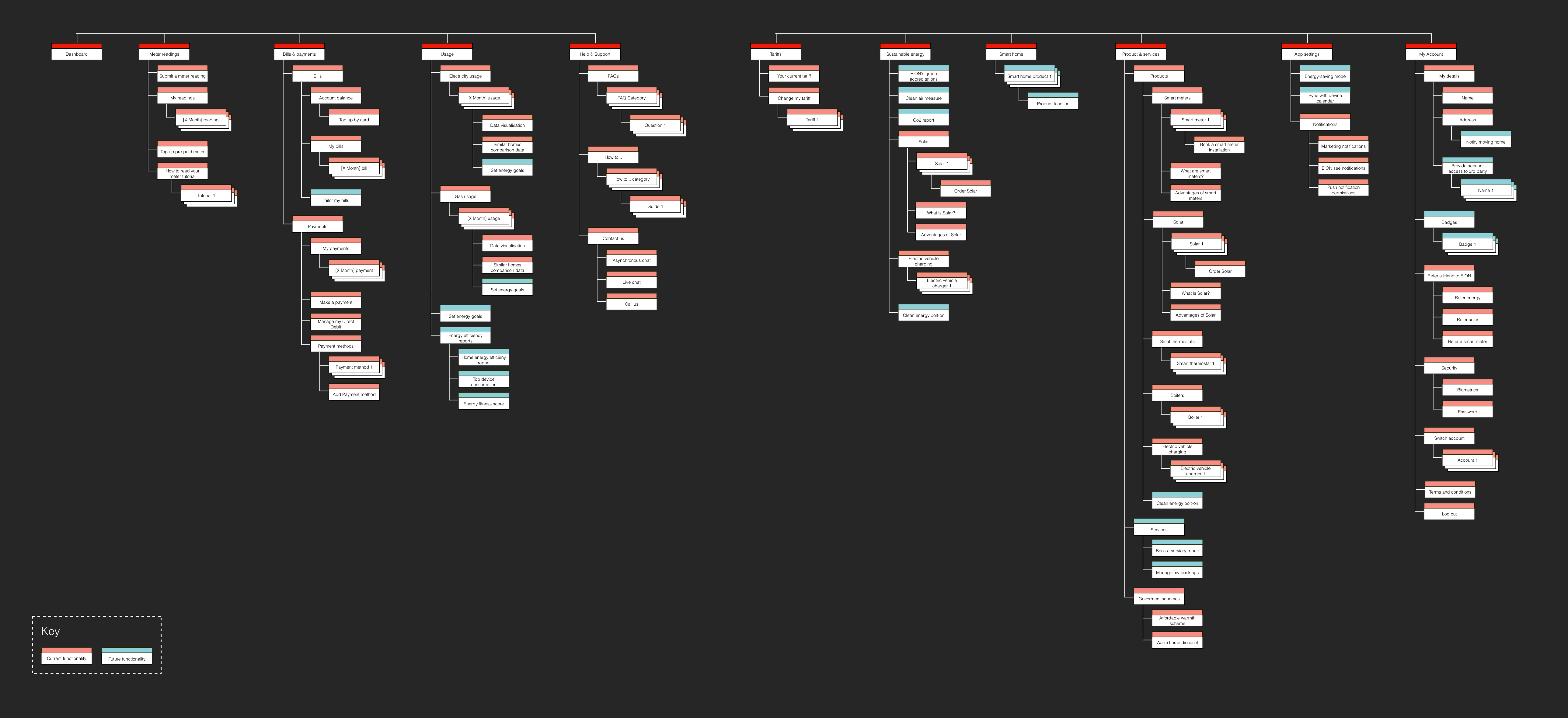
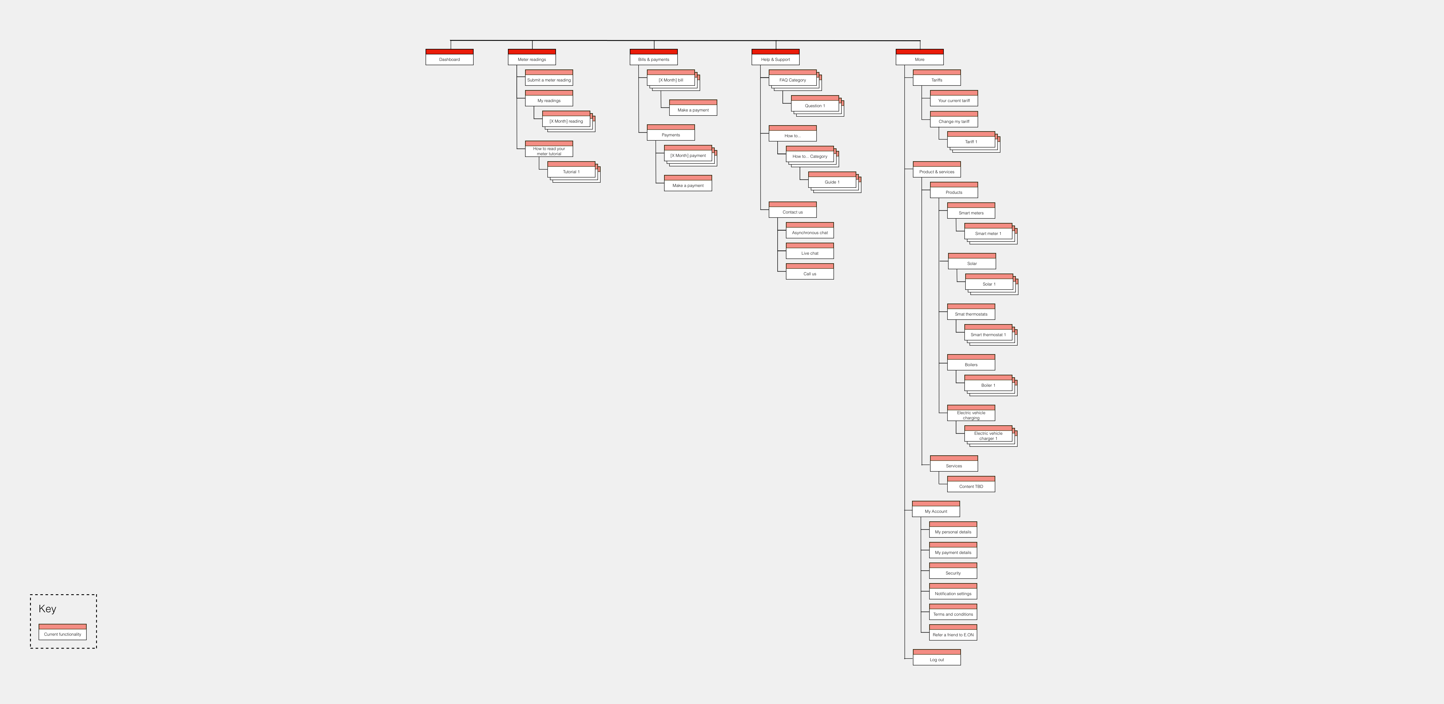
From the open card sort, we had a better understanding of how our customers organised and categorised content. I went on to produce a draft revised app information architecture based upon those findings. I revised the tier one and two categorisation and fundamentally re-structured the app.
Tree testing
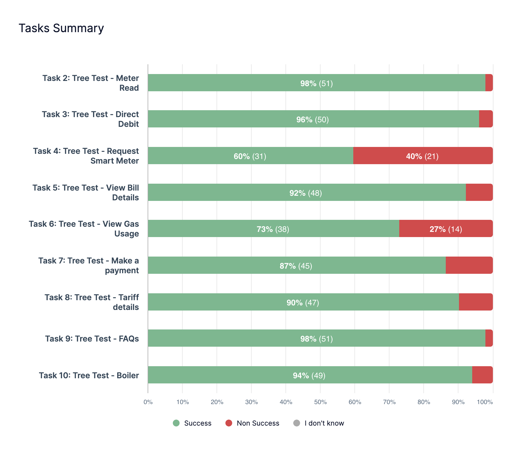
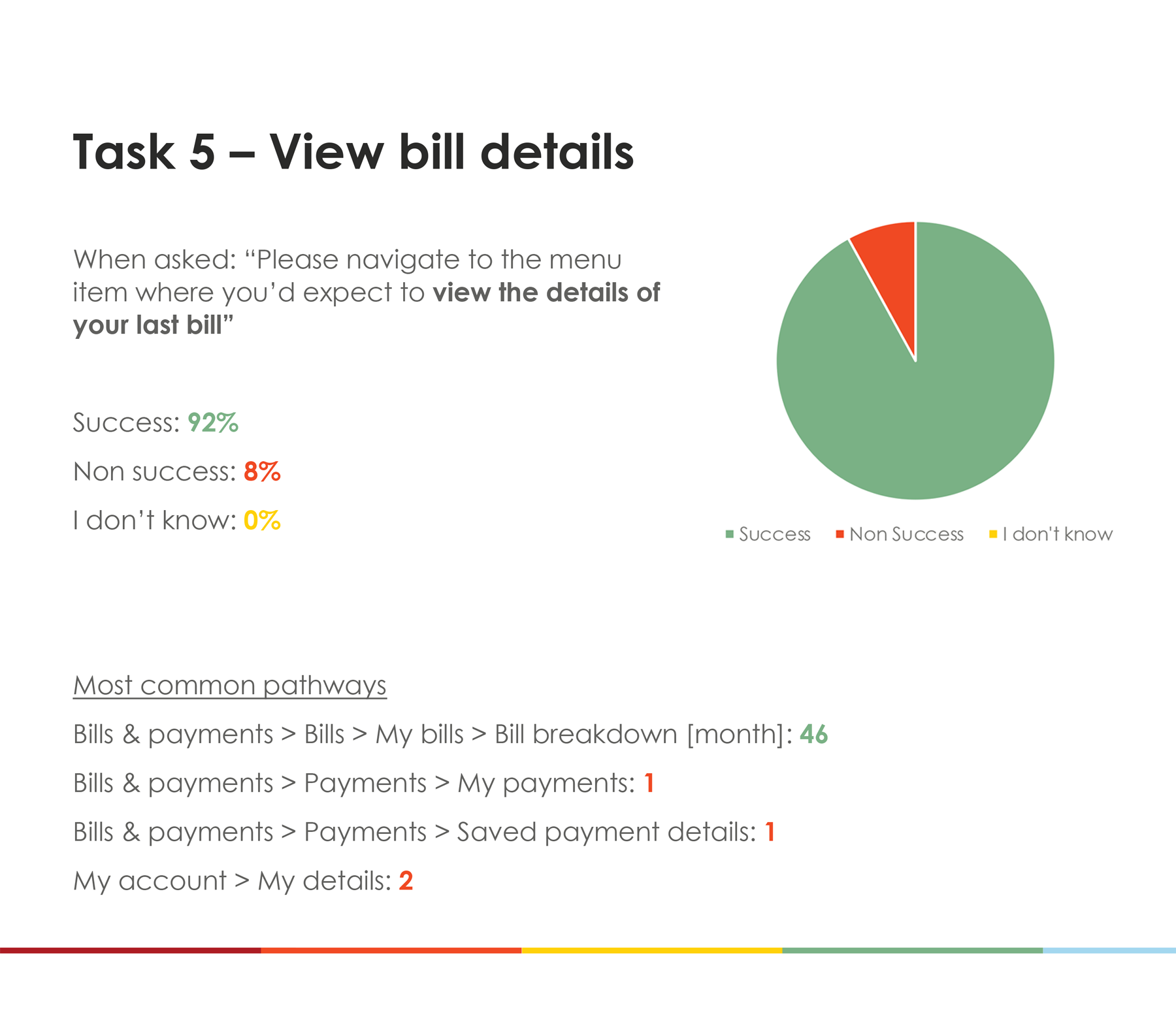
To test my newly formed draft revised information architecture, I conducted a tree test to evaluate if customers were able to find their desired content using my proposed revision. I asked 50 participants to be our target audience to navigate through 9 tasks. I shortlisted which tasks would be used by filtering the top 9 items within the prioritised list of 37 cards we used during the card sorting exercise.
Overall success rate: 86.2% / Non success rate: 13.8%
Testing design concept A & B
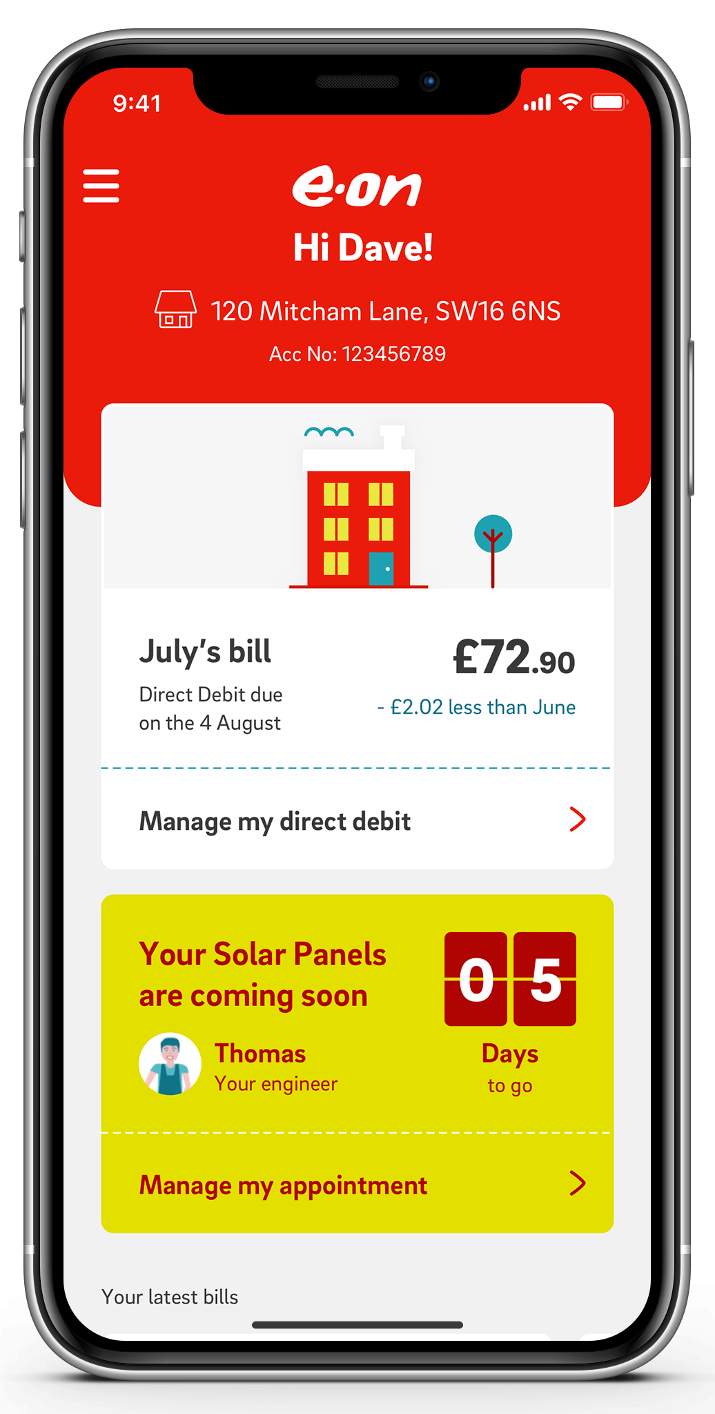
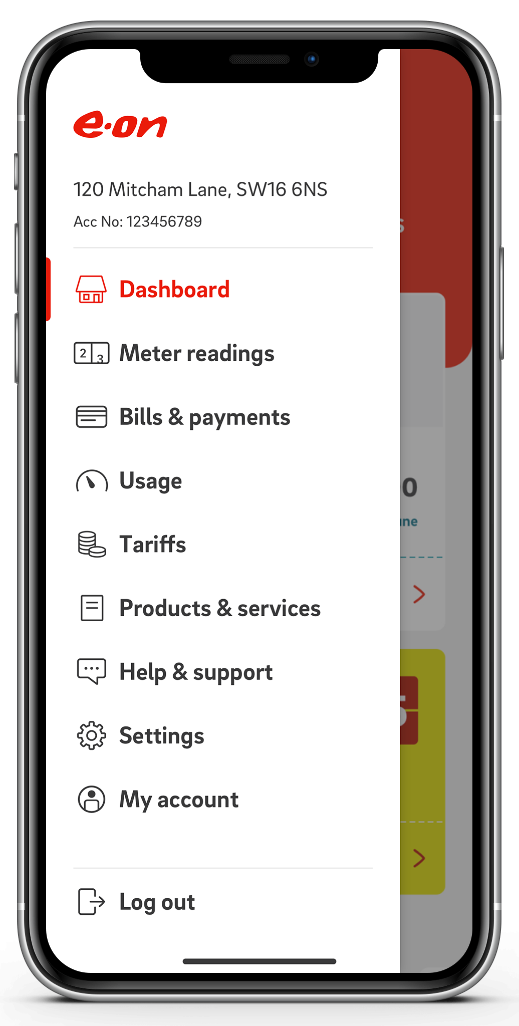
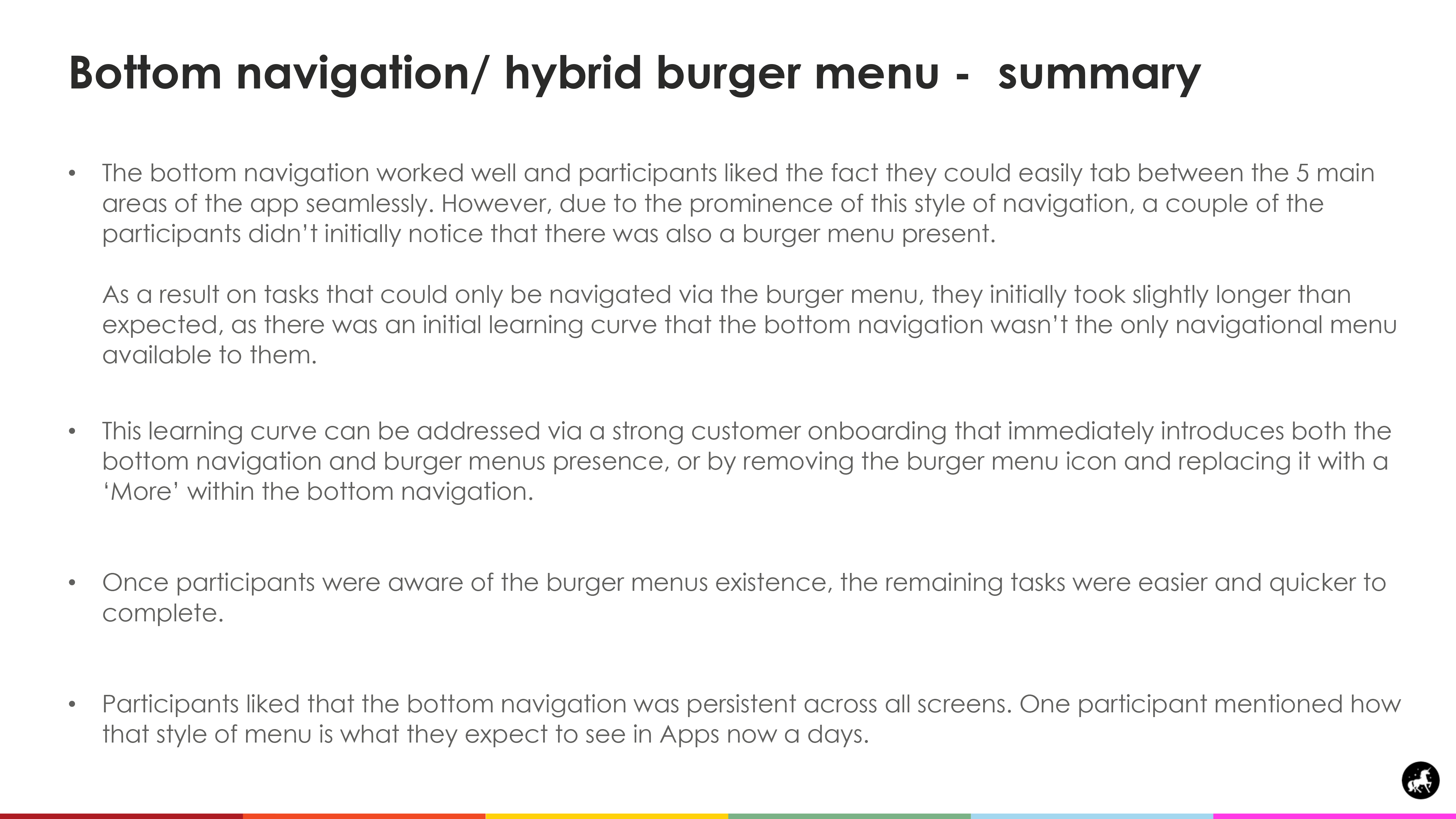
Post tree test, I was confident our revised app architecture was working as anticipated. The next stage was to move on to designing how the user interface would visually display our revised architecture. After exploring multiple concepts, we decided on progressing with two variations, concept A was a burger menu only and concept B was a hybrid bottom navigation/ burger menu. After providing scamps of the concepts, one of our Visual Designer’s Borja Sampedro mocked up the two concepts ready to be user tested.
To test the user interface I created an interactive prototype for each concept and conducted remote unmoderated user testing, where I asked 20 participants (10 for each concept) to navigate to the same prioritised 9 tasks from the earlier tree testing phase. To remove any bias, our participants only saw one version of the test so were only exposed to a single concept.
Concept A: Burger menu only
Concept B: Bottom navigation / hybrid burger menu
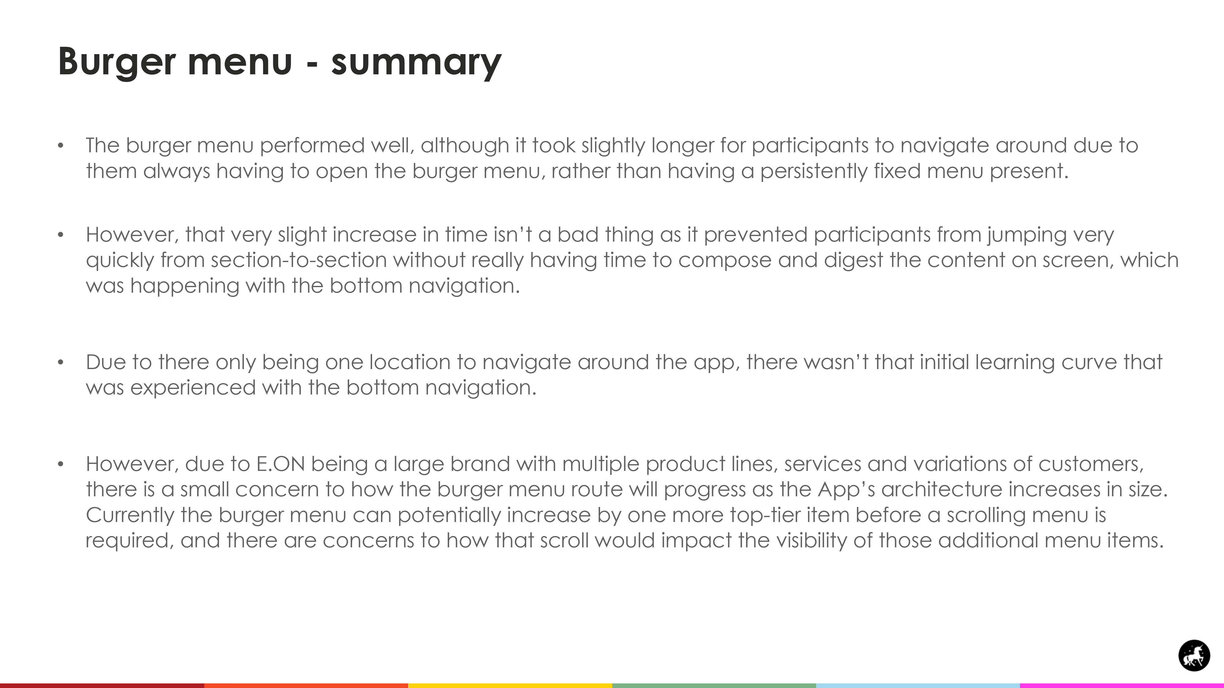
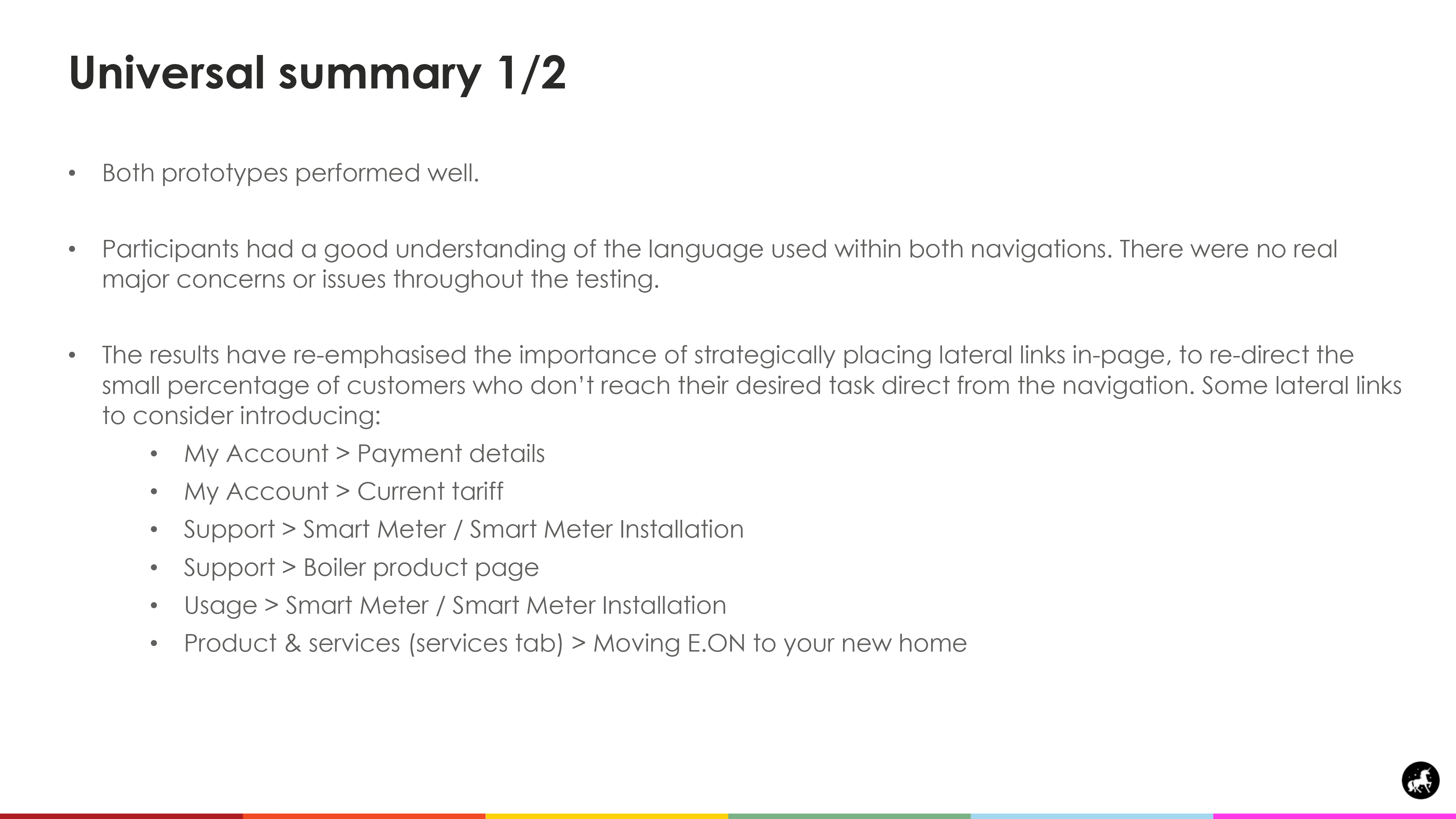
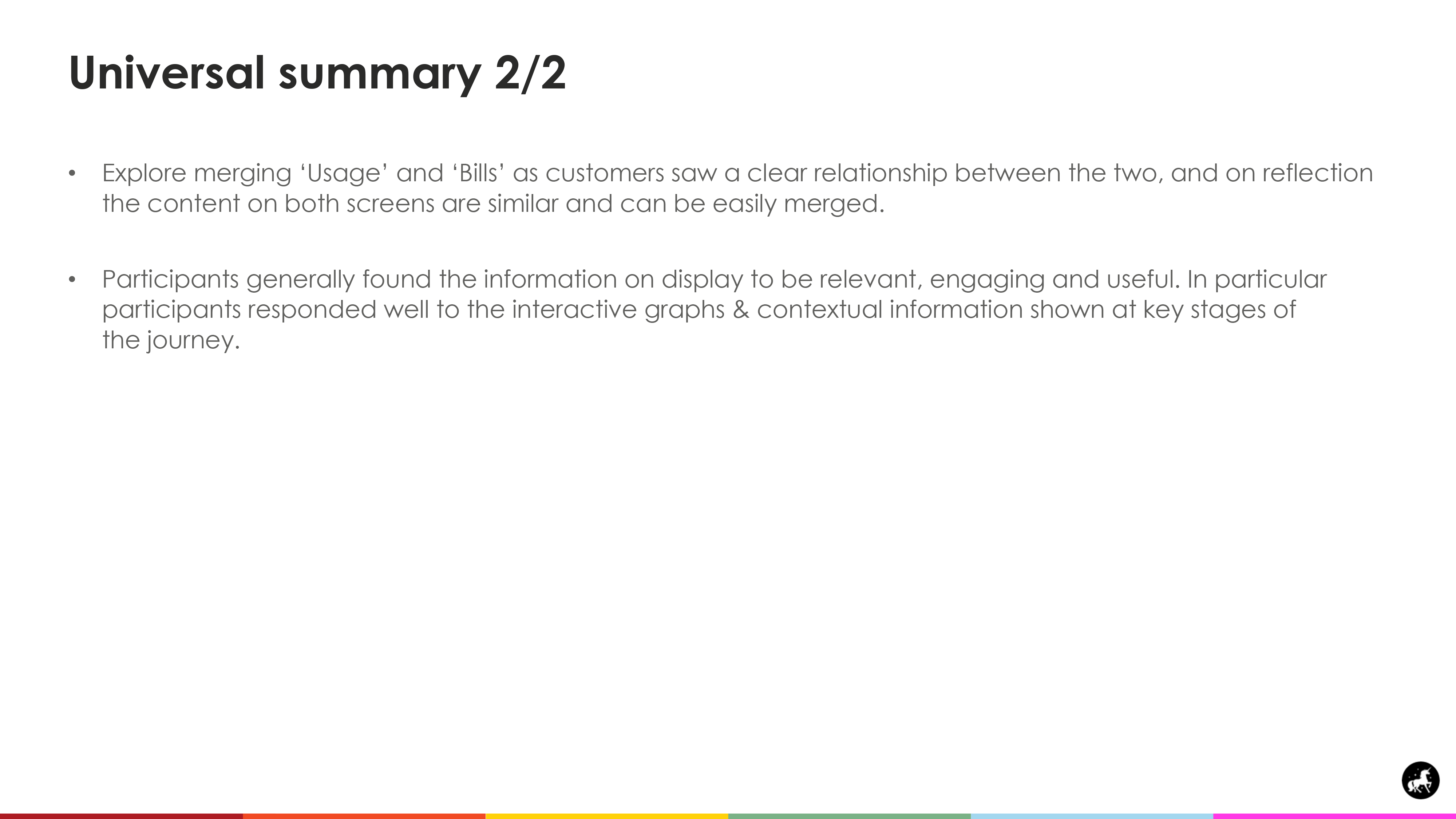
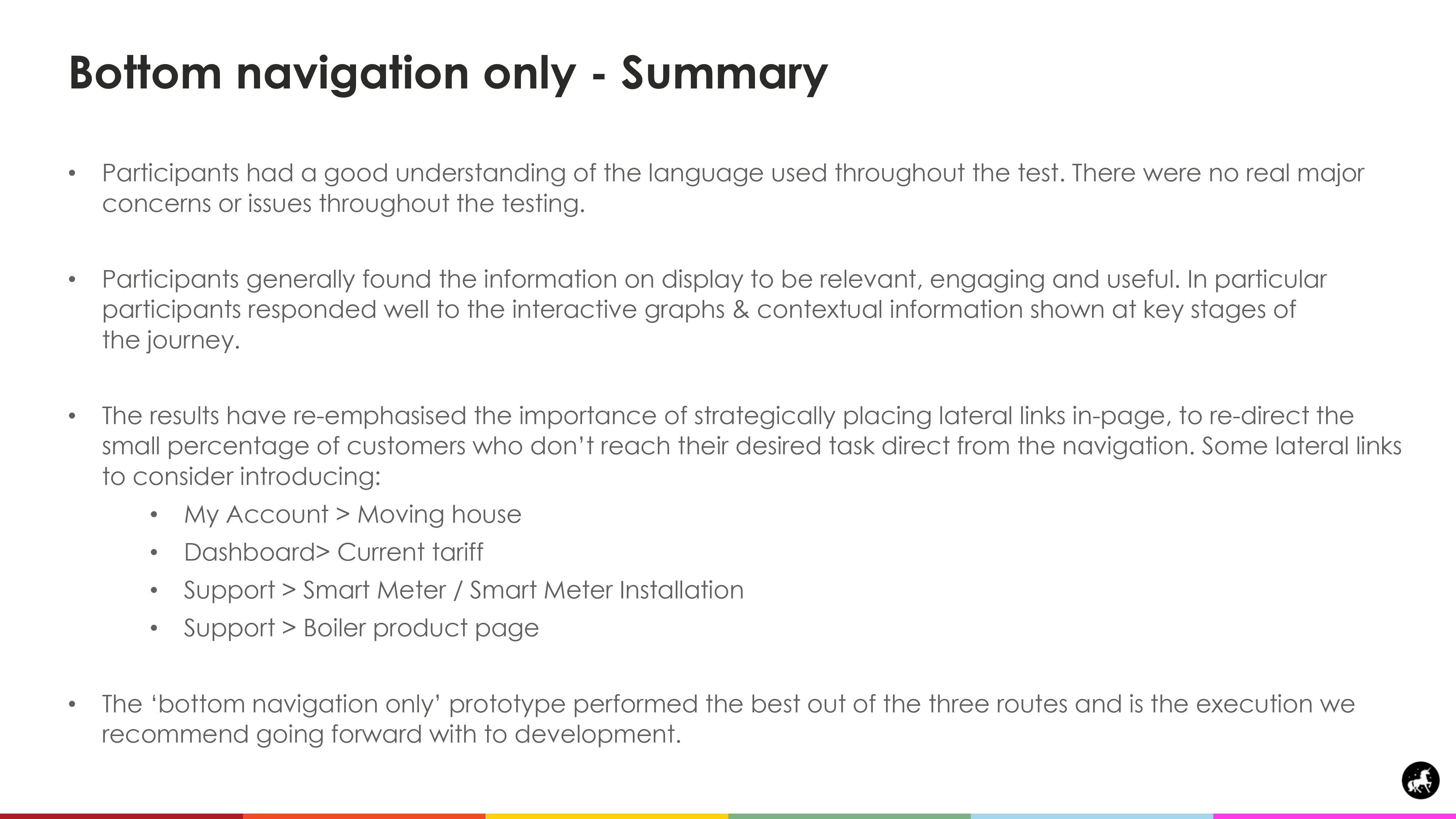
Test summary & recommendations
Testing design concept C
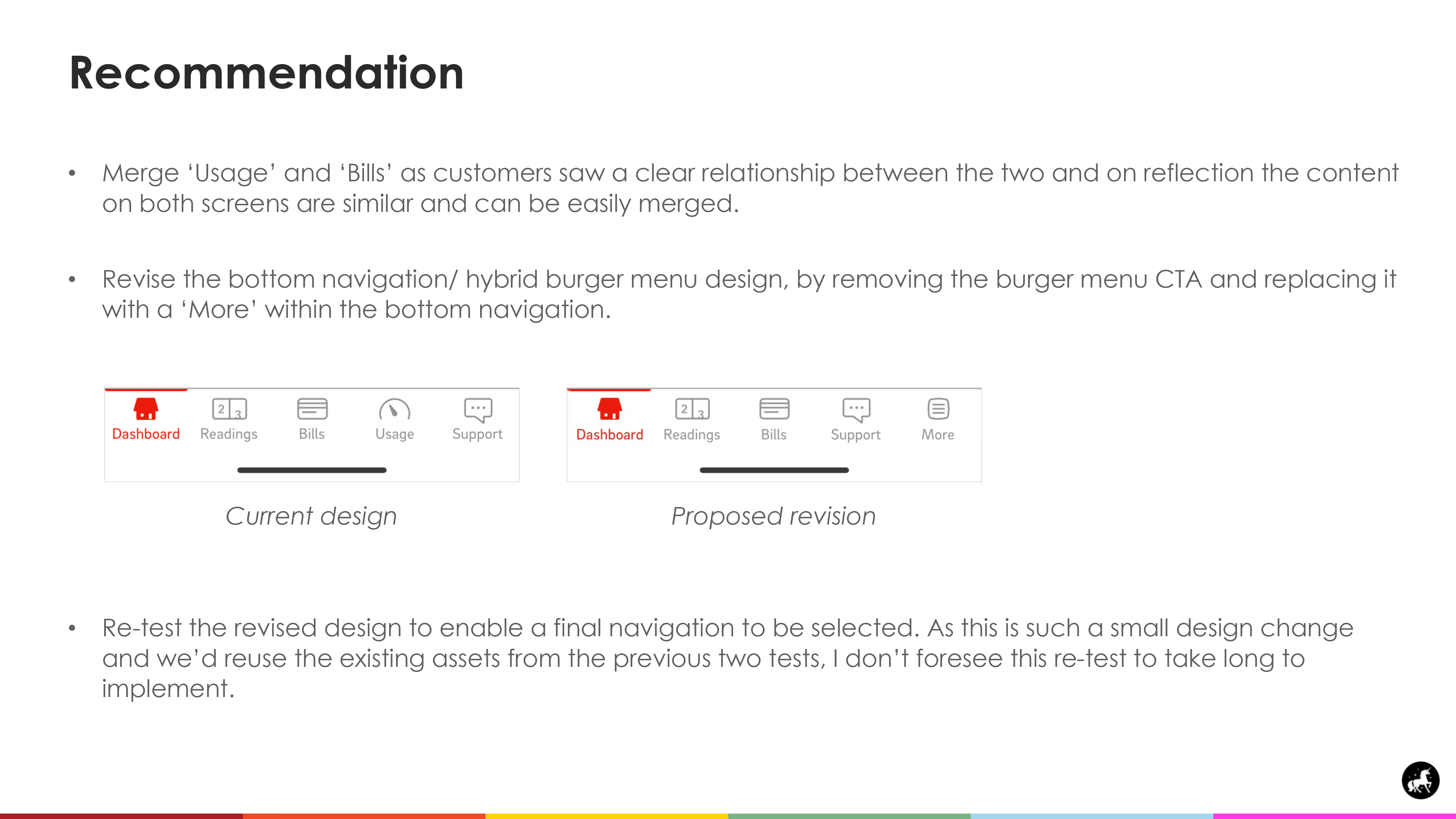
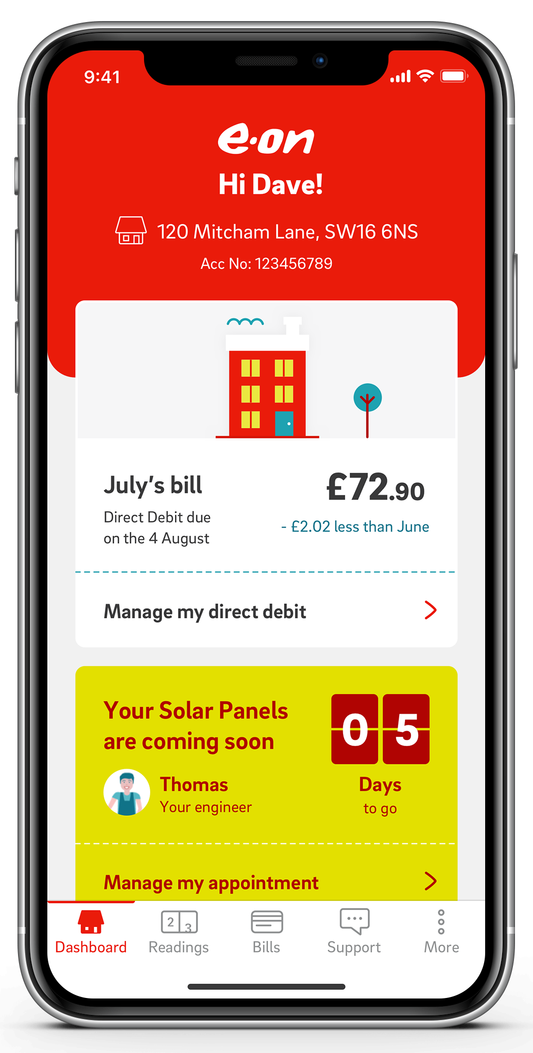
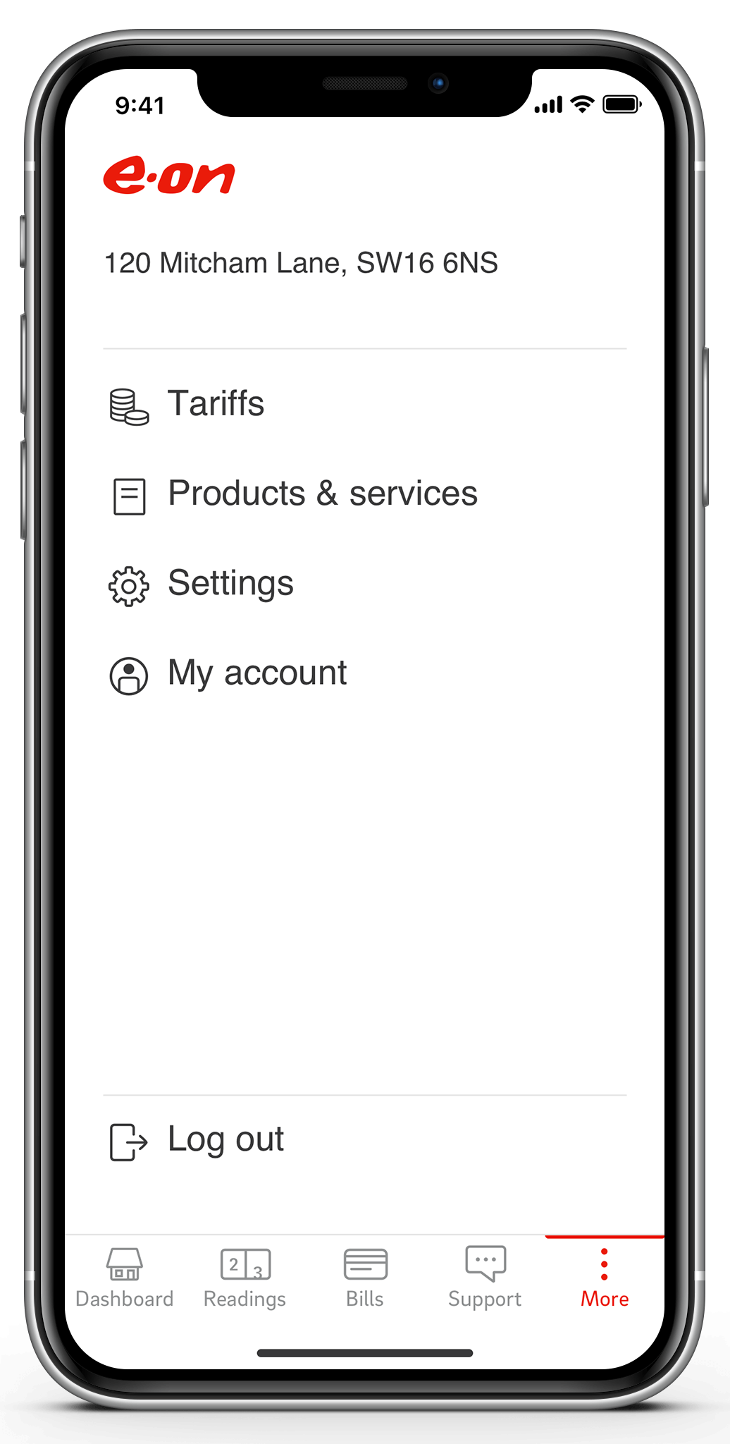
The first test highlighted some areas of opportunity to improve our design. I therefore revised the concept to incorporate the burger menu within the bottom navigation as the last item, to increase its discoverability. For consistency I re-ran the previous test, using 10 new participants. Concept C performed best amongst the three and was ultimately chosen for production.
Development
After presenting our findings from the testing cycle and client sign off, we proceeded with concept C. We provided our development team with final documentation on the apps revised architecture and navigation schematics. User journeys were created on Overflow to visually show the connecting nodes and lateral links between screens. I worked closely with our Business Analyst who created the user stories to accompany each task. Our execution is due to go live in Q4 of 2021.
Fancy a chat?
